Epic Radar Dashboard Creation with Clarity
Epic Radar Dashboards
Your Data Command Center
In a busy hospital, information is everything. A doctor needs to see a patient's latest lab results, a manager needs to track patient wait times, and an administrator needs to monitor bed availability across the entire facility. Getting this information quickly and clearly is crucial for providing good care and running a smooth operation.
This is where dashboards come in. They act like a command center, pulling data from many different sources and displaying it in one easy-to-understand place.
Dashboard
noun
A visual interface that provides at-a-glance views of key performance indicators (KPIs) relevant to a particular objective or business process.
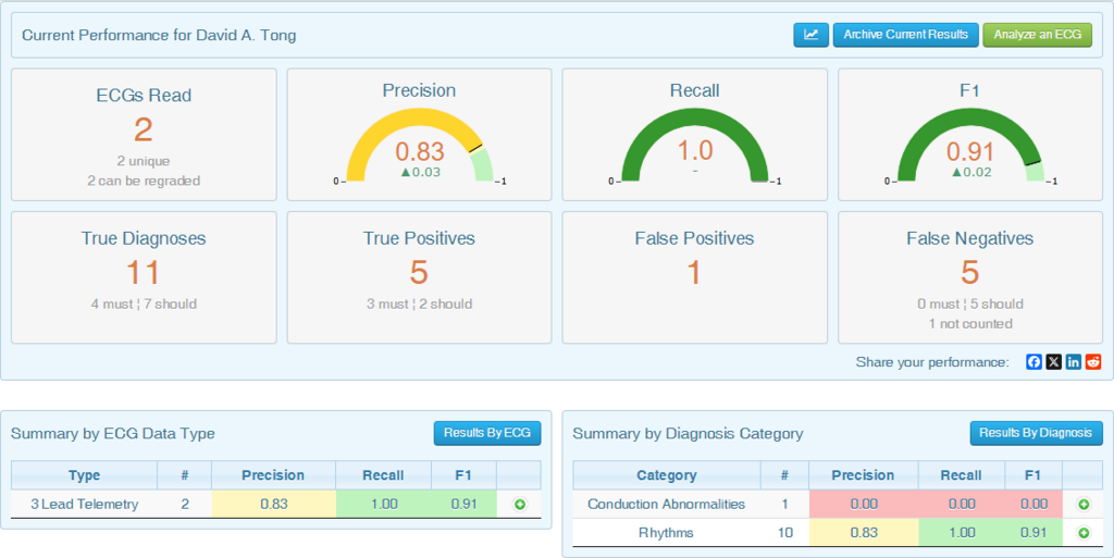
Within the Epic ecosystem, the primary tool for this is Radar. Radar isn't just a generic dashboard tool; it's specifically designed to work with the vast amounts of clinical and operational data stored in Epic. It provides a personalized, role-based window into the information that matters most to each user, from front-desk staff to surgeons.
Connecting the Dots
A Radar dashboard doesn't exist in a vacuum. Its real power comes from its deep integration with Epic's other reporting and analytics tools, like Reporting Workbench and Clarity. Think of these tools as the data collectors and organizers working behind the scenes.
- Reporting Workbench provides real-time operational reports directly from the live Epic database.
- Clarity is a relational database that stores a copy of Epic's data, optimized for complex, long-term analysis.
Radar acts as the presentation layer for these tools. It can pull a report from Reporting Workbench showing current emergency room wait times and place it right next to a graph from Clarity that trends patient admission rates over the last six months. This combination gives users both immediate operational awareness and deeper analytical insight on a single screen.
By bringing different types of data together, Radar helps break down information silos. A user doesn't need to run three separate reports to get a complete picture. Instead, they can open their personalized dashboard and see everything they need, presented visually.
A well designed Dashboard will provide: key information at a glance, real time data, easy to read graphics, clear entry points for exploration
Why Dashboards Matter in Healthcare
The importance of tools like Radar in a healthcare setting can't be overstated. They transform raw data into actionable insights that can improve patient care and operational efficiency.
For clinicians, a dashboard might display a list of their patients with overdue lab results, medication alerts, or upcoming appointments. This helps them prioritize tasks and ensures nothing falls through the cracks.
For hospital administrators, a dashboard can provide a high-level view of the entire organization. They can track metrics like bed occupancy rates, average length of stay, and insurance claim denials. This data is vital for making strategic decisions about staffing, resource allocation, and financial planning.
By presenting key data visually and in one place, Radar helps healthcare professionals make faster, more informed decisions, which ultimately leads to better patient outcomes.
Radar dashboards are configured based on a user's role. A nurse on the cardiology floor sees different information than a scheduler in the outpatient clinic. This customization ensures that users aren't overwhelmed with irrelevant data and can focus on the metrics that directly impact their work.
Ready to check your understanding?
What is the primary function of Radar within the Epic ecosystem?
A manager wants to view real-time emergency room wait times. Which underlying Epic tool is best suited to provide this specific data to a Radar dashboard?
In summary, Epic Radar dashboards serve as a critical visualization layer, integrating various data sources to provide role-specific, actionable insights for healthcare professionals.