Effective Form Design Principles
Introduction to Form Design
The Purpose of a Form
At its heart, a form is a conversation. It's a structured dialogue between a user and a digital product. Whether you're signing up for a newsletter, buying a concert ticket, or providing feedback, you're using a form to exchange information.
The main purpose of a form is to collect data from users in a structured way. This data allows the service to perform an action, like creating an account, processing an order, or saving user preferences. Think of it as the primary way users interact with a product to get something done.
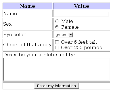
Because forms are so common, it's easy to overlook their design. But a poorly designed form can be frustrating. If a form is confusing, long, or difficult to use, people will simply give up. This is known as abandonment, and it's a major problem for businesses.
On the other hand, a well-designed form feels effortless. It guides the user through the process smoothly, making the interaction pleasant and efficient. Good forms build trust and make users feel capable and respected.
A good form is like a polite conversation. A bad form is like an interrogation.
Core Principles of Form Design
To create forms that people don't mind filling out, we can rely on a few key principles. These aren't strict rules but guiding ideas that help us make better design decisions. Let's look at four of the most important ones.
| Principle | What it Means |
|---|---|
| Clarity | Every label, instruction, and field is easy to understand. No jargon. |
| Simplicity | The form only asks for what's truly necessary and is logically organized. |
| Accessibility | The form can be used by everyone, including people with disabilities. |
| Responsiveness | The form works well on any device, from a small phone to a large desktop. |
Let's briefly touch on each of these.
Clarity is about clear communication. Users should immediately understand what information is needed for each field. This means using straightforward labels and providing helpful hints or examples where necessary.
Simplicity means respecting the user's time. A simple form asks for the minimum amount of information required to complete the task. It avoids clutter and presents questions in a logical order, sometimes breaking a long process into smaller, manageable steps.
Keep forms short and focused.
Accessibility ensures that your form is usable by people of all abilities. This includes designing for screen readers used by visually impaired individuals, ensuring there's enough color contrast, and making sure the form can be navigated using only a keyboard.
Finally, Responsiveness is about adapting to the user's context. A form should look and work just as well on a mobile phone as it does on a desktop computer. The layout should adjust to different screen sizes, and buttons should be easy to tap with a finger.
Ready to check your understanding?
What is the primary purpose of a form in a digital product?
When a user gets frustrated with a confusing form and decides not to complete it, what is this phenomenon called?
By keeping these fundamental principles in mind, you can create forms that are not just functional but also a positive part of the user experience.