Effective Data Visualization with Simple Charts
Understanding Data Visualization
What Is Data Visualization?
Data visualization is the art of turning raw data—spreadsheets full of numbers, long lists of names, dense paragraphs of text—into pictures. It translates complex information into a visual format, like a chart or graph, making it much easier to understand.
Think of it like this: a raw dataset is a block of uncarved marble. It holds potential, but it’s hard to see the shape within. A data visualization is the finished sculpture. It reveals the patterns, trends, and stories hidden inside the stone.
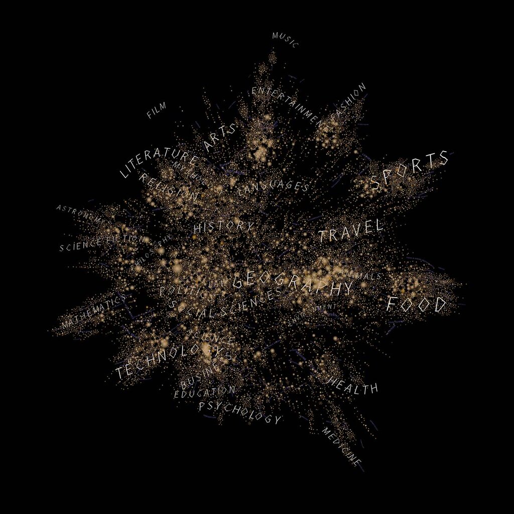
Why is this so important? Because our brains are wired to process images. We can grasp the meaning of a chart much faster than we can read through the numbers that chart is based on. A well-designed visual can reveal an outlier or a trend in seconds.
The purpose of data visualization is to present complex data in a way that is clear to understand and engages audiences.
A Toolbox of Common Charts
There are many ways to visualize data, but a few basic types handle most everyday needs. Knowing when to use each one is the key to clear communication.
Bar Charts: For Comparing Categories Use a bar chart when you want to compare quantities between different groups. The length of each bar represents a specific value, making it easy to see which category is bigger or smaller at a glance.
Examples: Comparing quarterly sales figures, the population of different countries, or the number of students in various school clubs.
Line Graphs: For Tracking Change Over Time A line graph is perfect for showing how a value changes over a continuous period. By connecting data points, it reveals trends, accelerations, and decelerations.
Examples: Tracking a company's stock price over a year, monthly rainfall amounts, or your own heart rate during exercise.
Pie Charts: For Showing Parts of a Whole Use a pie chart when you need to show proportions. The entire circle represents 100%, and each slice represents a percentage of that whole.
Examples: A survey showing the breakdown of favorite pizza toppings, a company's market share, or a budget allocation.
A word of caution: pie charts become hard to read when you have too many slices or when the values are very similar. For comparing categories, a bar chart is often a clearer choice.
Choosing the Right Visual
How do you decide which chart to use? The best choice always depends on the story you want to tell with your data.
First, identify your primary message. Are you trying to...
- Compare values? A bar chart is likely your best bet.
- Show a composition? A pie chart works well for a few categories.
- Track a trend? A line graph is the clear winner.
- Understand a relationship? You might use a scatter plot (which shows how two variables relate to each other).

The goal is not to make a pretty picture, but to provide insight. The right visualization makes complex data intuitive. It helps your audience see what you see, understand the key takeaways, and make better-informed decisions. A good chart doesn't just show data; it communicates meaning.
What is the primary goal of data visualization?
You are analyzing a dataset of website traffic for the past 12 months. You want to show how the number of daily visitors has changed over this period. Which chart is the best choice?
Choosing the right visual tool is the first step in turning data into a clear, compelling story.