Educational Website Design
Introduction to Educational Web Design
Designing for the Learner
When you design a website for learning, the student is your guest of honor. Every choice, from the layout to the color of a button, should be made with them in mind. This is the core of user-centric design: putting the needs of the learner first.
An educational website isn't just a container for information. It's an active part of the learning experience.
Think about what a learner comes to your site to do. Are they trying to complete a specific lesson, find a definition, or review for a test? A good educational design anticipates these goals and makes them easy to achieve. It removes distractions and focuses on what's important: the content. This means the design itself should feel almost invisible, allowing the student to concentrate on learning, not on figuring out how the website works.
Clear and Simple Navigation
Imagine trying to read a book with no table of contents and randomly ordered page numbers. You'd spend more time searching than reading. The same is true for a website. Intuitive navigation is crucial because it gives learners a clear map of the content.
When navigation is done well, users don't have to think about where to go next. They just know. This is achieved through logical menus, descriptive labels, and a consistent layout. A learner should always know where they are, where they've been, and where they can go.
Clear navigation reduces frustration and helps build confidence. When a learner feels in control of their environment, they are more open to absorbing new information.
A Solid Content Structure
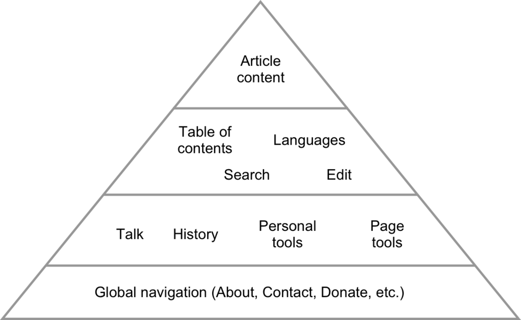
Beyond site-wide navigation, the structure of the content on each page is just as important. A wall of text is intimidating and hard to read. A well-structured page uses visual cues to guide the learner's eye and break information into digestible chunks.
This means using clear headings and subheadings to create a logical hierarchy. Short paragraphs, bulleted lists, and bold text for key terms all help to make content scannable and easier to understand. This visual organization isn't just about aesthetics; it helps the brain process and retain information more effectively. The most important information should be prioritized and presented first.
Accessible to Everyone
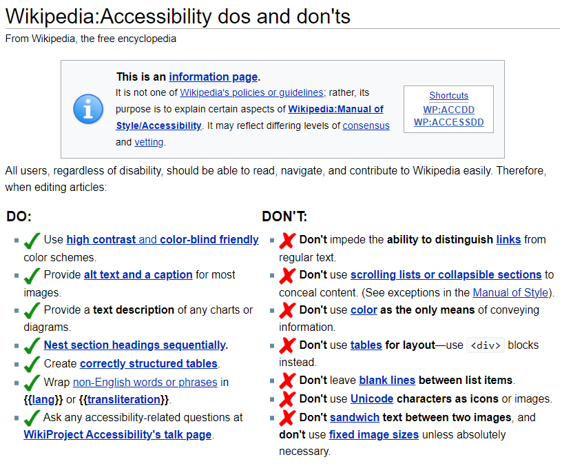
Education should be for everyone. That’s why accessibility is a non-negotiable principle of educational web design. An accessible website is one that can be used by people with a wide range of abilities and disabilities. This includes people who are visually impaired, have hearing loss, or have motor difficulties that affect how they use a mouse or keyboard.
Designing for accessibility involves practices like:
- Providing text alternatives (alt text) for all images.
- Ensuring sufficient color contrast between text and its background.
- Making sure the entire site can be navigated using only a keyboard.
- Using clear and descriptive link text.
The great thing about accessible design is that it often improves the experience for all users, not just those with disabilities. A clear, well-structured, and easy-to-navigate site is a better site for everyone.
Because instructional design considers learner needs, its primary goal is to make teaching more engaging, relevant and effective.
Ready to check your understanding of these core principles?
What is the primary goal of user-centric design in an educational website?
A well-structured page uses visual cues like headings, short paragraphs, and bulleted lists to make content easier to process. True or false?
By keeping the learner at the center of the design process, creating clear navigation and structure, and building for accessibility, you can create online learning experiences that are not just informative, but also effective and empowering.