Designing Instructional Symbol Sets
Geometric Sign Construction
The Geometry of 'Do' and 'Don't'
Universal symbols like the checkmark and the prohibition sign seem simple, but their effectiveness comes from precise geometric construction. These aren't just casual drawings; they're engineered to be understood in an instant, across languages and cultures. Getting them right requires a focus on angles, ratios, and balance.
Anatomy of a Prohibition Sign
The red circle with a slash is the universal symbol for "don't." Its design is standardized to ensure immediate recognition, a principle outlined in standards like for safety signage. The most critical rule governs the slash.
The prohibition slash must be drawn at a 45-degree angle, descending from top-left to bottom-right.
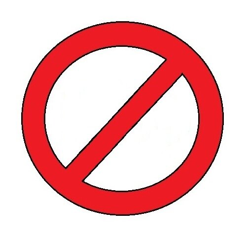
This specific angle isn't arbitrary. It provides a strong, dynamic negative that cuts across the symbol underneath without perfectly mirroring horizontal or vertical lines that might be part of that symbol. The direction is also a convention, creating a consistent visual language. The thickness of the circle and the slash are also related. A common guideline is for the stroke width of the circle to be 10% of its outer diameter. The slash should have the same stroke width.
The space inside the ring but outside the slash is the "safe zone." This is where the critical identifying features of the prohibited symbol must live. The ratio of the frame (the prohibition circle) to the subject (the pictogram underneath) is crucial. If the subject is too large, the slash will obscure it. If it's too small, it will be hard to see from a distance. The pictogram should typically fill about 60-70% of the diameter of the circle.
Constructing the Checkmark
The checkmark, or "Do" symbol, is simpler but still relies on geometric harmony for its clarity. Unlike the rigid rules of the prohibition sign, the checkmark offers more flexibility. However, a well-designed checkmark follows some general principles to avoid looking awkward or unbalanced.
The two strokes of the checkmark should be clearly distinct in length. A common ratio is for the longer stroke to be 2 to 3 times the length of the shorter one. The where they meet is also important; an angle between 90 and 120 degrees usually looks best. A sharp angle can feel aggressive, while a very wide one can look limp.
The visual weight of the two strokes should be equal. Even though one is longer, they should have the same thickness. This unity helps the eye perceive it as a single, coherent symbol. These aren't strict rules like those for safety signs, but they are strong guidelines for creating a checkmark that looks clean, clear, and positive.
Ready to test your knowledge on sign construction?
What is the primary reason the slash in a prohibition symbol is angled at 45 degrees from top left to bottom right?
According to common design guidelines for the prohibition symbol, what should the relationship be between the stroke width of the red circle and its outer diameter?
Mastering these geometric principles ensures your designs aren't just aesthetically pleasing, but are also functional, communicating their message with unmistakable clarity.