Design Fundamentals Mastery
Introduction to Design Principles
The Rules of Good Design
Have you ever looked at a poster, a website, or a magazine layout and thought, "Wow, that just works"? That feeling of rightness isn't an accident. It's the result of applying fundamental design principles. These aren't strict rules you must follow, but rather guidelines that help you arrange visual elements in a way that is both effective and pleasing to the eye.
Think of them as the grammar of visual language. They help you create compositions that are not just beautiful, but also clear and easy to understand. By learning these principles, you learn how to guide a viewer's eye, communicate a message, and create a sense of order and purpose in your work.
These principles of design help set a universal structure for creating visuals that don’t just look good but actually work as intended, too.
Creating Balance
Balance is about distributing the visual weight of objects, colors, texture, and space. When a design is balanced, it feels stable and complete. If it's unbalanced, it can feel unsettled.
There are two main types of balance:
-
Symmetrical Balance: Elements on one side of a design are similar to those on the other side, like a mirror image. This creates a feeling of formality and stability. Think of the human face or the front of a classical building.
-
Asymmetrical Balance: The sides are different, but still feel balanced. A large, visually heavy element on one side can be balanced by several smaller elements on the other. This often feels more dynamic and modern.
Neither type of balance is better than the other. The choice depends entirely on the feeling you want to evoke. Symmetrical design is straightforward and calming, while asymmetrical design can create more visual tension and interest.
Making Things Stand Out
How do you make sure people see the most important part of your design first? You use contrast and hierarchy.
Contrast refers to the arrangement of opposite elements to create visual interest or draw attention. This can mean using light colors against dark colors, thick lines next to thin lines, or large text with small text. Without contrast, a design can feel flat and be hard to navigate. It's what makes certain elements pop.
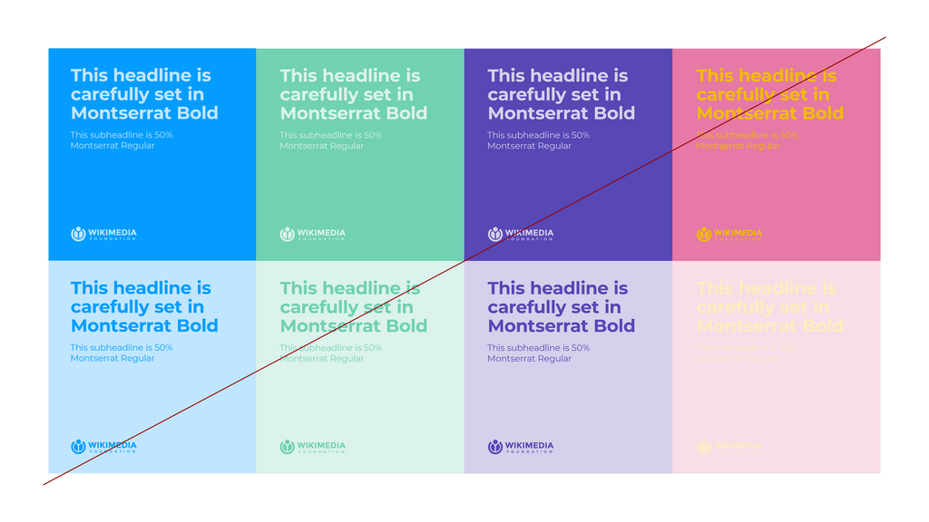
Hierarchy is a direct result of good contrast. It's the principle of arranging elements to show their order of importance. A designer will make the most important element the most prominent through size, color, or placement. For example, on a webpage, the main headline is usually the largest text, followed by smaller subheadings, and then even smaller body text. This tells the reader what to look at first, second, and third.
Organizing Your Space
A good design isn't just about the individual elements; it's also about how they relate to each other and the space they occupy. This is where alignment, proximity, repetition, and white space come into play.
Alignment is about creating a sharp, ordered appearance by placing elements so their edges or centers line up. Nothing should be placed on the page arbitrarily. Every element should have a visual connection to another element. This creates a cleaner, more organized look.
Proximity helps you organize information. It involves grouping related items together. When elements are close to each other, they are perceived as a single group rather than a scattering of unrelated parts. This reduces clutter and makes content easier for a viewer to scan and understand.
Repetition strengthens a design by repeating key elements like colors, shapes, or fonts. This helps create a sense of unity and consistency. For example, using the same style for all the headlines on a website helps the user recognize them as headlines and navigate the page more easily. Repetition ties individual elements together and is crucial for branding.
Finally, there's White Space. This is simply the empty space around the elements in your design. It's also called negative space. Far from being wasted, white space is one of the most important tools a designer has. It gives your content room to breathe, reduces clutter, and can be used to draw attention to the most important elements. Good use of white space makes a design feel open, clean, and modern.
These principles are the foundation of all strong visual design. By understanding and applying them, you can start to create work that is not only aesthetically pleasing but also communicates its message with clarity and power.
A designer places a large photograph on the left side of a poster and balances it with a block of text and a smaller logo on the right side. What type of balance is being used?
Which principle is most directly used to establish a visual hierarchy, guiding the viewer on what to look at first?