Design Fundamentals Mastery
Introduction to Design Principles
The Rules of Good Design
Have you ever looked at a poster or a website and just thought, "Wow, that looks good"? It’s not an accident. Good design relies on a set of foundational ideas called design principles. Think of them as the grammar of a visual language. They guide how elements are arranged to create something that is not only nice to look at, but also clear and effective.
These aren't strict laws you must always obey, but rather time-tested guidelines. Mastering them helps you make deliberate choices instead of just guessing what works. We'll walk through seven of the most important principles: balance, contrast, hierarchy, repetition, proximity, alignment, and white space.
The principles of design suggest how a designer can best arrange the various components of a page layout to connect to the overall design and to one another.
Achieving Visual Balance
Balance
noun
The distribution of the visual weight of objects, colors, texture, and space. A balanced design feels stable and pleasing to the eye.
Just like in the physical world, every element in a design has a certain weight. Big, dark, or complex elements feel heavier than small, light, or simple ones. Balance is about arranging these elements so the design doesn't feel lopsided. There are a few ways to achieve this:
- Symmetrical Balance: Elements are mirrored on either side of a central axis. This creates a formal, orderly, and calm feeling.
- Asymmetrical Balance: The two sides are not identical, but the elements are arranged to have equal visual weight. A large element on one side might be balanced by several smaller elements on the other. This often feels more dynamic and interesting.
- Radial Balance: Elements are arranged around a central point, like spokes on a wheel. It naturally draws the eye to the center.
Creating Emphasis
Not all parts of a design are equally important. Two key principles, contrast and hierarchy, work together to guide the viewer's attention to what matters most.
Contrast is what you use when you want something to pop. It’s created by making two elements dramatically different. This could be light vs. dark colors, thick vs. thin lines, large vs. small shapes, or modern vs. traditional fonts. Contrast helps create focal points, which are the first things a viewer's eye is drawn to.
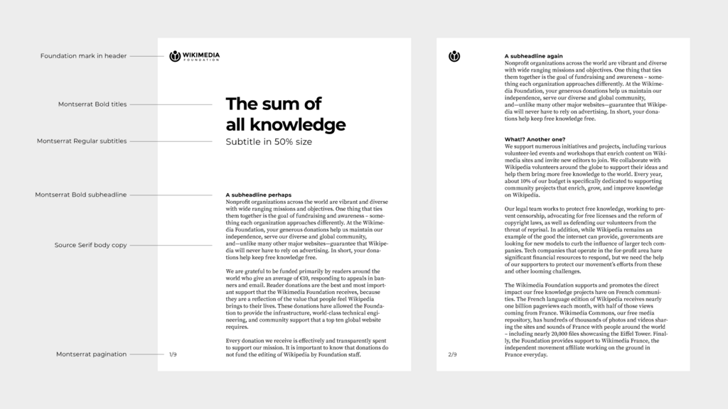
Hierarchy is the result of using contrast effectively. It’s the visual arrangement of elements in order of their importance. A webpage headline is usually the biggest, boldest text on the page, followed by a smaller sub-headline, and then even smaller body text. This structure tells you what to read first, second, and third. Without a clear hierarchy, information becomes a confusing jumble.
Building Unity
While contrast and hierarchy create emphasis, other principles help tie a design together, making it feel cohesive and organized rather than chaotic. Repetition, proximity, and alignment are all about creating unity.
Repetition
noun
The act of reusing the same or similar elements throughout a design to create consistency and strengthen the overall message.
Proximity is simple: you group related items together. When elements are placed close to each other, they are seen as a single unit. Think about a business card. Your name, title, and phone number are all grouped together because they are related pieces of information. This helps organize information and reduce clutter.
Alignment brings order to a design. It’s about how the edges of elements line up with each other. Instead of placing items randomly, aligning them along a common edge or center creates a cleaner, more organized look. Even when elements aren't close, alignment can create a subtle, invisible connection between them.
Finally, there’s the principle of white space. This is the empty area around and between the elements in a design. It's not just blank background; it’s an active design element. White space gives your content room to breathe, reduces clutter, and can even be used to create focus. A design with plenty of white space often feels more modern, elegant, and easier to read.
One of the most important design principles, white space (or negative space) ensures clarity, focus, and balance.
These seven principles are the building blocks of strong visual communication. By understanding how they work, you can begin to see why some designs succeed and others fail, and start applying that knowledge to your own work.