Design Fundamentals
Introduction to Design Principles
The Rules of Seeing
Have you ever looked at a poster or a website and just... gotten it? You knew exactly where to look first, what was most important, and how to find the information you needed. That's not an accident. That’s the result of good design.
Design isn’t just about making things look pretty. It’s a form of communication. Just like grammar organizes words into clear sentences, design principles organize visual elements into a clear message. These principles are the unspoken rules that guide a viewer's eye and make information easy to digest.
Creating Stability
Balance is the principle of distributing visual weight. Imagine a seesaw. To keep it level, you need to balance the weight on both sides. In design, every element—text, images, shapes—has a certain weight. Big, dark, or complex elements feel heavier, while small, light, or simple elements feel lighter.
There are two main types of balance:
- Symmetrical Balance: This is like a mirror image. Elements are evenly distributed on either side of a central axis, creating a formal, stable feeling. Think of the human face.
- Asymmetrical Balance: This is more dynamic. Instead of mirroring, it uses elements of different weights to create balance. A large, heavy element on one side might be balanced by several smaller, lighter elements on the other. It feels more modern and energetic.
Neither type of balance is better than the other. The choice depends on the feeling you want to create. Symmetrical balance is calm and orderly, while asymmetrical balance is often more interesting and dynamic.
Making Things Stand Out
How do you make sure people see the most important part of your design first? You use contrast and hierarchy. They work together to guide the eye and create focus.
Contrast is simply about making things different. It's the difference between light and dark, big and small, thick and thin, or modern and traditional. Strong contrast makes an element pop, drawing the viewer's attention.
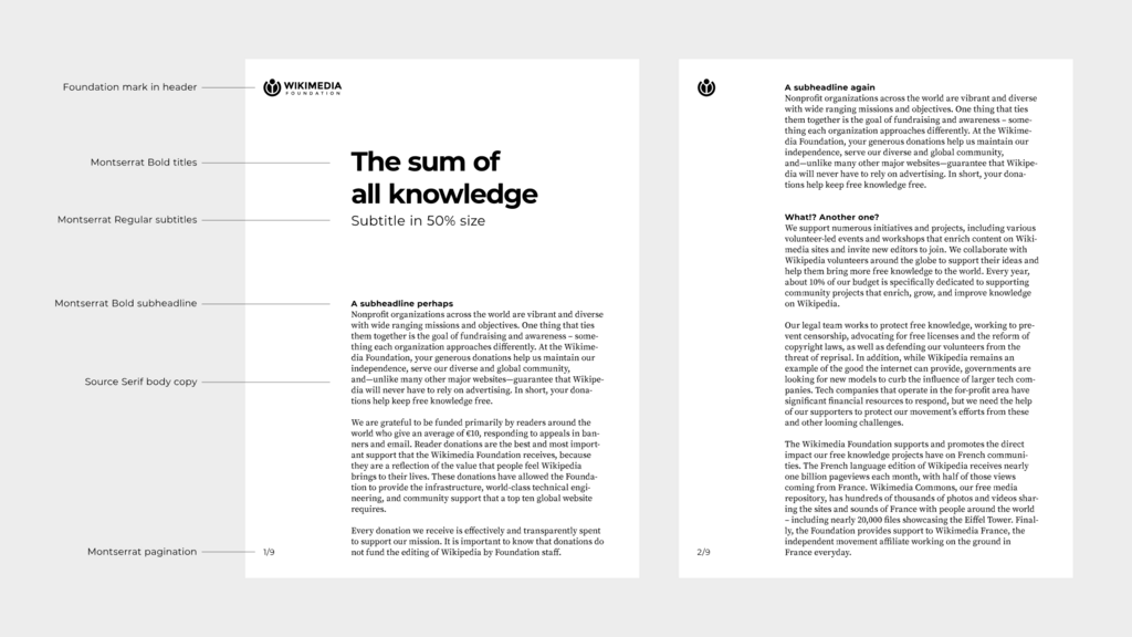
Contrast is a key tool for creating hierarchy. Hierarchy is the arrangement of elements in order of importance. In a well-designed piece, you instantly know what to read first, second, and third. A large, bold headline has more importance than the smaller body text below it. This creates a clear path for the viewer to follow, preventing them from feeling overwhelmed.
Building a Unified Whole
While contrast creates emphasis, other principles work to tie everything together. Repetition, proximity, alignment, and white space create order, clarity, and a sense of unity.
Repetition is the reuse of the same or similar elements throughout a design. This could be a consistent color, font, shape, or even a specific layout style. Repetition makes a design feel cohesive and strengthens its overall theme. It's like the chorus of a song—it brings everything together and makes it memorable.
Proximity is about grouping related items together. When elements are placed close to each other, they are perceived as a single unit. This simple idea helps organize information and reduce clutter. For example, on a business card, you expect the name, title, and phone number to be grouped together, separate from the company's address.
Alignment means that nothing on the page should be placed arbitrarily. Every element should have a visual connection to another element. When elements are aligned, they create a clean, organized, and intentional look. Common types include left, right, and center alignment. Proper alignment is one of the most subtle but powerful ways to make a design look professional.
white space
noun
The empty space between elements in a design. It is also known as negative space.
Finally, white space is the space between elements. It's not just
Pay attention to the use of negative space and pleasing proportions used in designs which appeal to you
blank canvas—it’s an active part of the design. White space gives elements room to breathe, reduces clutter, and improves readability. It can also be used to create focus, drawing the eye toward the most important content by separating it from everything else.
By understanding these fundamental principles, you can start to see the world differently. You’ll notice why some designs work and others don’t, and you’ll have the vocabulary to understand how visual messages are built.
Which type of balance is often used to create a formal, stable, and orderly feeling in a design?
On a business card, grouping the person's name, title, and phone number together is an application of which design principle?