Design a Business Flyer
Understanding Flyer Design Principles
Flyers That Actually Work
A flyer is often the first physical thing a potential customer sees from your business. It needs to do more than just list your services and address; it needs to make an impression. Good design isn't about being fancy. It's about being clear and effective. The goal is to create something that's easy to read, looks professional, and clearly communicates who you are and what you offer.
Layout and Hierarchy
Imagine picking up a flyer. Where do your eyes go first? A good design directs your attention intentionally. This is called visual hierarchy. It's the art of arranging elements to show their order of importance.
Most people in Western cultures scan a page in a 'Z' or 'F' pattern. They start at the top-left, scan across, move down and to the left, and scan across again. Knowing this helps you place your most important information where it will be seen first. Your headline or key offer should be at the top. Supporting details can follow, and your contact information or call to action should be at the bottom right, a natural finishing point.
A well-designed flyer uses visual hierarchy to guide the reader through the content effortlessly.
Think of it like telling a story. You need a beginning (the headline), a middle (the details), and an end (what to do next). A grid can help you organize the space and keep everything aligned and tidy. This structure makes the information easier to digest.
Typography and Readability
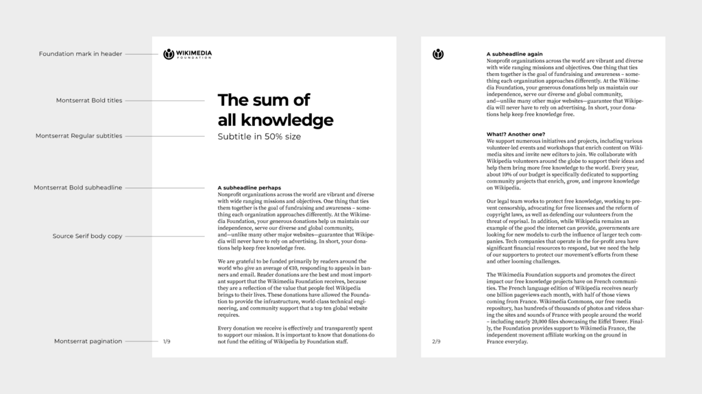
The fonts you choose say a lot about your brand. Are you modern and clean, or traditional and elegant? A simple rule is to use no more than two or three fonts. One for your headline, one for your body text, and maybe a third for accents. This keeps the design from looking chaotic.
Readability is key. Your headline font can be bold and attention-grabbing, but your body text must be easy to read. Sans-serif fonts (like Arial or Helvetica) are often used for a clean, modern look, while serif fonts (like Times New Roman or Garamond) can feel more classic and formal. Use different sizes and weights (bold, regular, light) to create contrast and reinforce the visual hierarchy we just talked about.
Color, Space, and Brand
Color isn't just decoration; it sets the mood. Bright, bold colors can create excitement, while muted tones might feel more sophisticated. Your flyer's color scheme should align with your brand's existing colors. This consistency helps build brand recognition. If your logo is blue and gray, using those colors on your flyer connects it back to your business instantly.
Just as important as the elements you add is the space you leave empty. This is called white space, and it's not wasted space. It gives your content room to breathe, reduces clutter, and makes the flyer feel more organized and approachable. A crowded flyer is overwhelming and often gets ignored.
A cluttered flyer overwhelms the reader, but a clean, organized layout keeps them engaged.
Finally, every design choice—from layout and fonts to colors and imagery—should feel like it comes from the same place. Your flyer, website, and social media should all feel connected. This consistency builds trust and makes your brand look professional and reliable.
Time to test your knowledge.
What is the primary purpose of establishing a visual hierarchy in a flyer design?
According to typical reading habits in Western cultures, where should you place the most important information, like your main headline?
By focusing on these core principles, you can create a business flyer that not only looks great but also effectively communicates your message and helps attract new customers.