Decoding Stock Charts for Traders
Stock Chart Basics
The Language of the Market
Stock charts are the language of the market. They translate the complex dance of buying and selling into a visual story, allowing us to see a stock's performance over time. At their core, charts track price. For any given period, whether it's a minute or a month, there are four key prices traders watch:
- Open: The first price a stock traded at when the market opened for that period.
- High: The highest price the stock reached during that period.
- Low: The lowest price the stock hit.
- Close: The final price the stock traded at when the period ended.
Together, these four data points are often called OHLC (Open, High, Low, Close).
Three Ways to See Price
Different charts use the OHLC data to tell their story in slightly different ways. The simplest is the line chart.
A line chart connects the closing prices over a series of periods. It's clean and simple, excellent for spotting the overall trend at a glance. However, it leaves out the rest of the OHLC data. You can't see the price swings that happened within each day.
For more detail, traders use bar charts. Each period is represented by a vertical bar. The top of the bar is the high, and the bottom is the low. A small horizontal tick on the left shows the opening price, and a tick on the right shows the closing price.
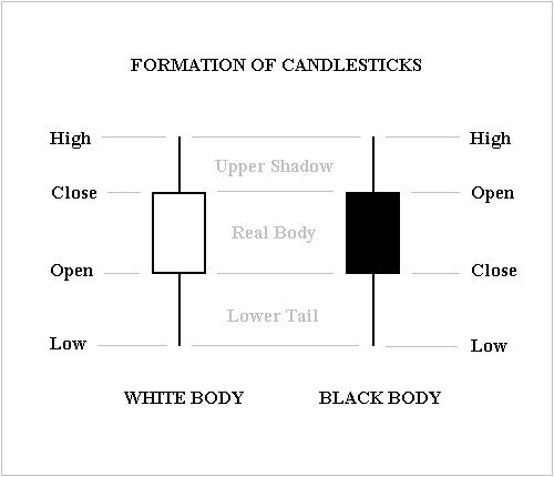
The most popular format today is the candlestick chart. It packs the same OHLC information as a bar chart into a more intuitive visual. Each candlestick has a wide part, called the "real body," and thin lines above and below, called "wicks" or "shadows."
The real body shows the range between the open and close price. The wicks show the highs and lows. The color of the body tells you if the price went up or down. A green (or white) candle means the price closed higher than it opened. A red (or black) candle means it closed lower.
Volume Confirms the Move
Price tells you what happened, but volume tells you how much conviction was behind the move. Volume is simply the total number of shares traded during a specific period. It's usually displayed as a bar graph at the bottom of the price chart.
Volume
noun
The total number of shares of a security traded during a given period of time.
Why does it matter? High volume suggests strong interest and can confirm a price trend. For example, if a stock's price jumps up on very high volume, it signals that many buyers are eager to get in, making the upward move more significant. Conversely, a big price move on low volume might indicate a lack of broad participation, suggesting the move might not last.
Think of it like a crowd's reaction. A loud cheer from a huge stadium crowd is more impactful than a cheer from a few people.
By combining price action (what you see in the candlesticks) with volume, you get a much clearer picture of the market's underlying strength or weakness. It's a fundamental skill for reading charts effectively.
Time to check your understanding of these core concepts.
In stock chart analysis, what does the 'O' in OHLC stand for?
An investor wants to quickly see the general direction of a stock's price over the past year, ignoring the daily price swings. Which type of chart is best suited for this purpose?
Mastering these basics—line, bar, and candlestick charts, along with the significance of volume—is the first step toward analyzing market behavior.