Data Visualization Fundamentals
Introduction to Data Visualization
Seeing the Story in the Numbers
Data visualization is the art and science of turning raw data into pictures. Think of it like this: a massive spreadsheet of numbers is like a list of street names and addresses. It’s accurate, but not very useful for figuring out how to get from point A to point B. A map, on the other hand, shows you the same information visually. Suddenly, you can see the relationships between streets, find the quickest route, and spot landmarks. That's what data visualization does for data.
The purpose of data visualization is to present complex data in a way that is clear to understand and engages audiences.
It’s not about making data look pretty, though good design helps. The real goal is to make data understandable. By representing numbers in graphical forms like charts, graphs, and maps, we can uncover patterns, trends, and connections that would be nearly impossible to find in a table of raw figures. It bridges the gap between the technical world of data and human intuition.

A Quick Trip Through Time
Visualizing data isn't a new idea born from the computer age. It goes way back. Early maps from centuries ago were a form of data visualization, translating geographic information into a usable format. But the field really took off in the late 18th century with a Scottish engineer named William Playfair. He’s credited with inventing the line graph, bar chart, and pie chart, giving us the basic tools we still use today.
Another key figure was Florence Nightingale. During the Crimean War in the 1850s, she didn't just write reports about the poor sanitary conditions killing soldiers. She created a compelling diagram, a type of polar area chart, to visually show that more soldiers were dying from disease than from battle wounds. Her chart was so clear and powerful that it persuaded Queen Victoria and Parliament to improve hospital conditions, saving countless lives.
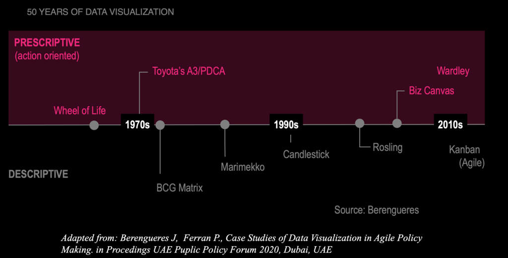
The arrival of computers revolutionized the field. What once took painstaking manual effort can now be done in seconds, allowing for more complex and interactive visualizations that help us explore vast datasets in real time.
Why We Visualize
Our brains are wired to process visual information incredibly quickly. We can spot a trend in a line chart in an instant, while it might take several minutes to draw the same conclusion from a spreadsheet. This efficiency is one of the main benefits of data visualization.
Visualizing data makes complex information digestible, reveals hidden patterns, and helps tell a compelling story.
By plotting data, we can identify relationships between different variables. Are sales going up when marketing spend increases? Is there a correlation between ice cream sales and temperature? Visuals make these connections jump out.
Beyond just finding patterns, visualizations are powerful communication tools. They help us share our findings with others in a clear and persuasive way. A simple, well-designed chart can tell a story, support an argument, and drive decision-making far more effectively than a dense report.
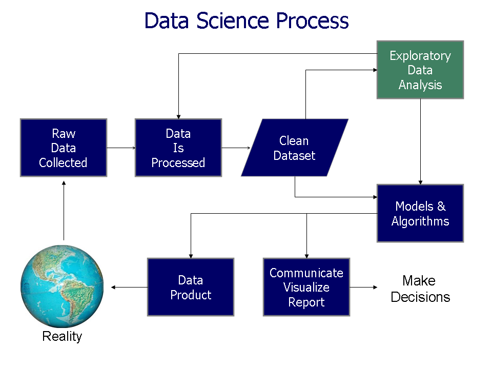
Data visualization is used everywhere. Businesses use it to track sales performance and understand customer behavior. In healthcare, it helps doctors analyze patient data to identify disease trends. Scientists visualize climate data to understand global warming, and journalists use infographics to explain complex news stories. It’s a universal language for making sense of the world through data.
What is the primary goal of data visualization?
Who is credited with inventing the line graph, bar chart, and pie chart in the late 18th century?
That's a brief look at the what, why, and how of data visualization. It's a fundamental skill for anyone working with data, turning numbers into insights that can be seen, understood, and acted upon.