Data Visualization for Persuasive Reports
Introduction to Data Visualization
Turning Numbers into Stories
Data on its own is just a collection of facts and figures. A spreadsheet with thousands of rows might hold incredible secrets, but to the human eye, it's just a wall of numbers. Data visualization is the art and science of translating that raw data into a visual context, like a chart or a map, to make it easier for our brains to understand.
The main goal is to transform complex information into clear, compelling stories that can inform and inspire action.

Think of it this way: you could read a dense scientific paper describing the effects of climate change, or you could look at a map that shows rising sea levels over time. Both convey the same information, but the visual map tells the story instantly. It makes patterns, trends, and outliers pop out in a way that raw numbers rarely do.
Why It Matters
Our brains are wired for visuals. We can process images and patterns far more quickly than we can read text or crunch numbers. This makes visualization a powerful tool for analysis and communication. When you present data visually, you're not just showing numbers; you're helping people see the story behind them.
This ability to communicate complex ideas clearly is crucial for making good decisions. A well-crafted visualization can highlight a critical business trend, reveal a scientific discovery, or help a team understand its progress towards a goal. It bridges the gap between data experts and everyone else, allowing for shared understanding and smarter conversations.
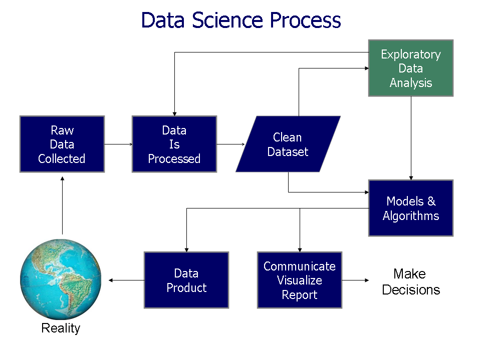
The Core Principles
Creating an effective visualization isn't just about making something look good. It's about communicating information effectively. To do that, we rely on a few key principles.
Clarity
noun
The quality of being coherent and intelligible. In data visualization, it means the main message is immediately and easily understood.
A clear visual doesn't make you work hard to understand it. The most important information should be the most prominent. If your audience has to squint, search, or read a long explanation to understand the point, the visualization has failed. The story should be apparent at a glance.
Accuracy
noun
The quality or state of being correct or precise. In data visualization, it means the visual representation faithfully reflects the underlying data.
An inaccurate visualization is worse than no visualization at all because it can actively mislead people. This means using appropriate scales, labeling correctly, and avoiding any visual tricks that might distort the data's meaning. The goal is to present the truth of the data in a visual form, not to bend it to fit a preconceived narrative.
Simplicity
noun
The quality or condition of being easy to understand or do. In data visualization, it means removing all non-essential elements.
Simplicity is about removing the unnecessary so the necessary can shine. Every color, line, and label should serve a purpose. If it doesn't help the audience understand the data, it's just clutter that gets in the way of the message. Avoid distracting 3D effects, busy backgrounds, or too many colors. Let the data itself be the focus.
A well-designed visualization should be clear, engaging, and easy to interpret, ensuring that viewers can quickly grasp insights without confusion.
By sticking to these principles, you can create visuals that don't just show data, but tell a powerful and honest story.