Data Visualization for Persuasive Reports
Introduction to Data Visualization
Making Sense of the Numbers
Data visualization is the art and science of turning raw data—spreadsheets full of numbers, long lists of names, complex measurements—into visual formats. The goal is to make information easier for our brains to understand. Instead of scanning a massive table, you can glance at a chart and immediately grasp the key message.
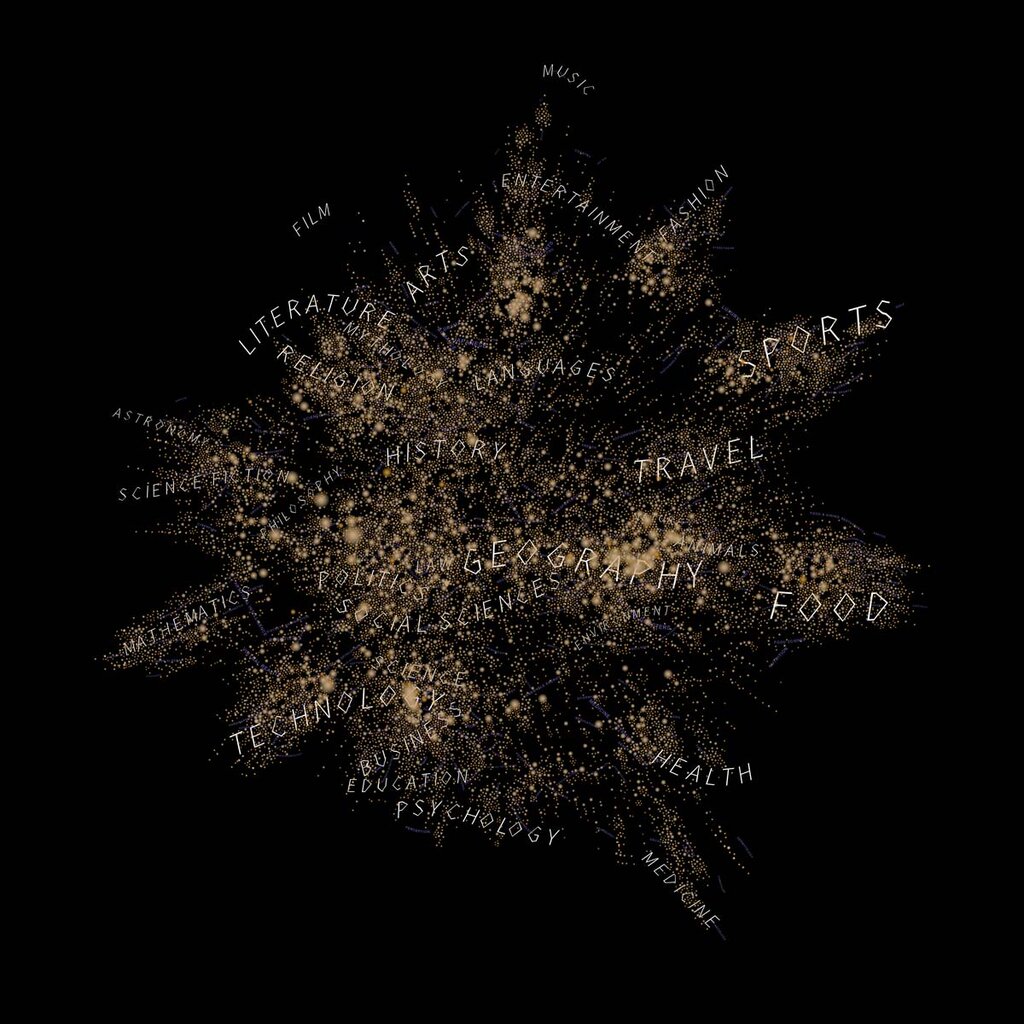
Think of it like this: Reading a long paragraph describing the twists and turns of a road trip is one thing. Seeing a map with the route drawn out is another. The map gives you the full picture in an instant. Data visualization does the same thing for information, helping us see patterns, trends, and outliers that might otherwise stay hidden.
A Brief History
While it feels like a modern buzzword, data visualization has been around for centuries. Early maps from the 1600s used geographic data to chart new territories. In the 18th century, pioneers like William Playfair invented the line graph and bar chart to represent economic data, changing how people understood national debt and trade.
One of the most famous historical examples comes from Florence Nightingale. During the Crimean War in the 1850s, she used a unique diagram, sometimes called a rose chart, to show that more soldiers were dying from poor sanitation in hospitals than from wounds on the battlefield. Her powerful visualization convinced the British government to improve conditions, saving countless lives. This proved that a good chart could not only inform but also persuade and drive change.
The Benefits of Seeing Data
Visualizing data isn't just about making things look pretty. It offers powerful, practical advantages.
Finds the Story: Data can be dense and overwhelming. A visualization cuts through the noise and highlights the core message. It helps you see the story at a glance, whether it's soaring profits, a dip in user engagement, or a regional anomaly in public health statistics.
Speeds Up Understanding: Our brains are wired to process visual information incredibly fast—much faster than text. A single, well-designed chart can convey information that would take several paragraphs to explain. This speed is critical for making timely decisions.
Uncovers Hidden Insights: Sometimes the most important findings aren't obvious in a spreadsheet. Visualizing data can reveal unexpected correlations, patterns, or outliers. You might notice two metrics that move together or a sudden spike that warrants further investigation, insights you would have missed by just looking at the raw numbers.
By transforming data into a visual format, we make complex information more digestible and actionable.
There are some common challenges, though. A misleading visualization can be worse than no visualization at all. Using the wrong chart type, distorting the scale of an axis, or cluttering a graphic with too much information can confuse the audience or lead to incorrect conclusions. The goal is always clarity and honesty in representation.
A World of Visuals
Data visualizations come in many forms, each suited for different purposes. Without getting into specific types, they generally help us do a few key things:
- Comparison: See how different groups or categories stack up against each other.
- Relationships: Understand how different variables relate to one another. Are they connected? Does one affect the other?
- Distribution: See how data points are spread out. Are they clustered together or widely scattered?
- Composition: Understand the parts that make up a whole. What percentage of the budget goes to each department?
Choosing the right way to display data is the first step toward creating a powerful and insightful visual story.
Now that you have a grasp of what data visualization is and why it's so important, you're ready to explore the specific techniques that bring data to life.