Data Visualization for Persuasive Reports
Introduction to Data Visualization
What Is Data Visualization?
Data visualization is the art of turning numbers and text into a visual story. Think of it like translating a book into a language everyone can understand at a glance. Instead of poring over spreadsheets or long reports, you get a chart or a map that shows you the key message instantly.
The main purpose is to make sense of complex information. Our brains are wired to process images far more quickly than text. By representing data visually, we can spot patterns, trends, and outliers that might otherwise go unnoticed. It’s about revealing the insights hidden within the raw data.
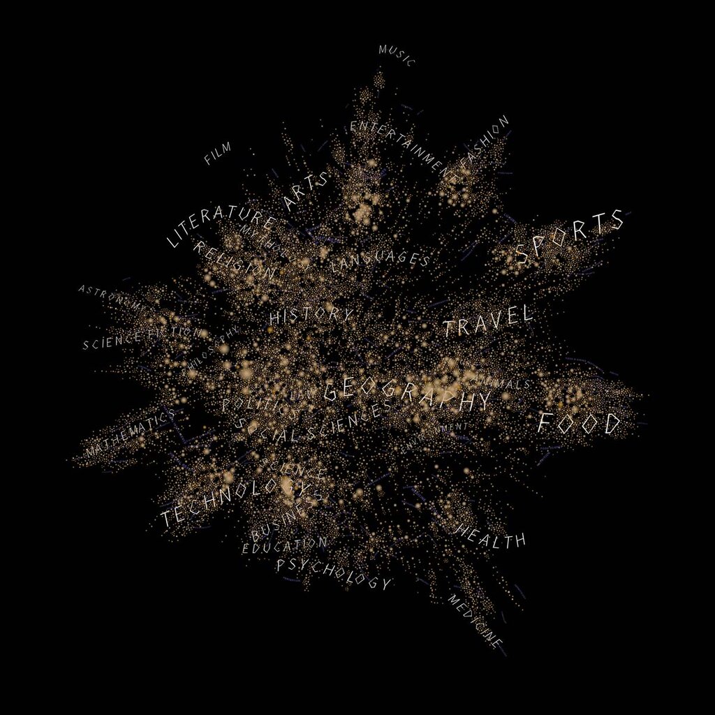
Why Bother Visualizing Data?
Visualizing data offers several powerful advantages. First, it brings clarity. A simple bar chart can make a comparison far more obvious than a table of figures. It cuts through the noise and gets straight to the point.
Second, it's fast. You can absorb the information in a well-designed graphic in seconds. This speed is crucial for making quick, informed decisions. Instead of spending hours analyzing raw numbers, you can get the gist almost immediately and focus on what to do next.
Finally, visualization helps you tell a compelling story. Data on its own can be dry and unconvincing. But when you pair it with strong visuals and a clear narrative, you can explain your findings in a way that resonates with your audience and persuades them to act.
However, visualization isn't a magic bullet. The biggest challenge is avoiding misinterpretation. A poorly designed chart can be more misleading than the raw data itself. Using the wrong scale, confusing colors, or an inappropriate chart type can lead your audience to the wrong conclusions. The goal is always to illuminate, not to obscure.
A good visualization clarifies complexity. A bad one creates confusion where none existed before.
Tools of the Trade
A wide array of tools exists to help create data visualizations. You don't need to be a graphic designer to get started. Many familiar programs, like spreadsheet software, have built-in charting capabilities that are perfect for basic tasks.
For more complex projects, there are specialized business intelligence (BI) platforms and programming libraries. These tools offer greater flexibility and power, allowing for the creation of interactive dashboards and highly customized graphics. The right tool depends entirely on the complexity of your data and what you want to achieve.

Now, let's check your understanding of these core concepts.
What is the primary goal of data visualization?
A poorly designed chart can be more misleading than the raw data itself.
By transforming data into a visual format, you make it accessible and actionable for yourself and others.