CSS Flexbox and Figma Design
Introduction to CSS Flexbox
What Is Flexbox?
Before Flexbox, arranging elements on a webpage could be tricky. Developers used hacks with floats and positioning, which often led to fragile and complicated code. Flexbox changed all of that.
CSS Flexbox is a layout model designed for arranging items in a single dimension, either as a row or as a column. Think of it as a powerful tool for distributing space and aligning items within a container. It makes creating flexible and responsive designs much simpler.
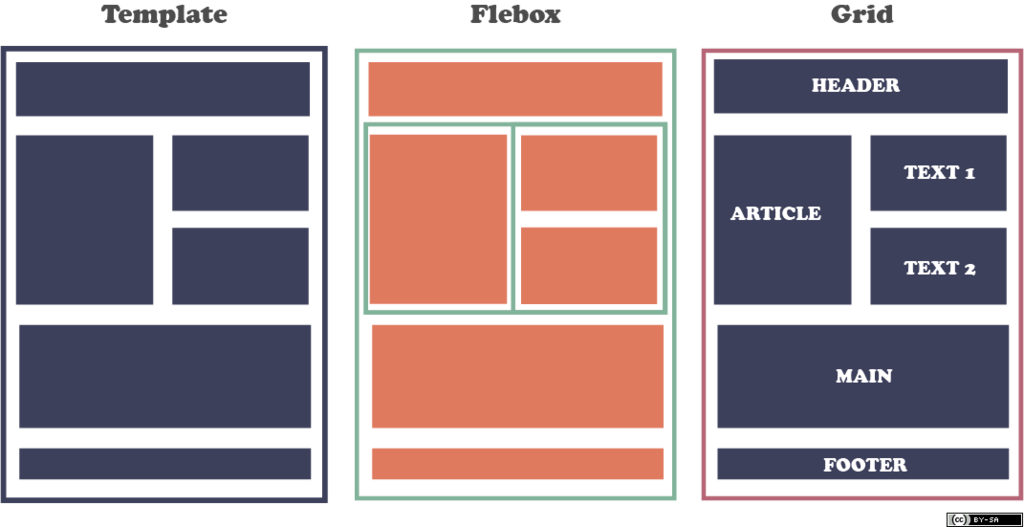
When you use Flexbox, you're primarily working with two types of elements.
Core Concepts
To get started with Flexbox, you first need to understand its core terminology. The two most important pieces are the flex container and flex items.
- The flex container is the parent element. You create one by setting its CSS
displayproperty toflex. - The flex items are the direct children of the container. Once their parent becomes a flex container, they automatically behave like flex items.
Flexbox layouts are built around two axes: the main axis and the cross axis. The main axis is the primary direction in which flex items are laid out. The cross axis is perpendicular to the main axis.
The direction of these axes is not fixed. It depends entirely on a property called flex-direction.
Basic Flexbox Properties
With the core concepts down, let's look at the CSS properties that make it all happen. It all starts with display: flex.
/* HTML */
<div class="container">
  <div>Item 1</div>
  <div>Item 2</div>
  <div>Item 3</div>
</div>

/* CSS */
.container {
  display: flex;
}
Applying
display: flexto.containerturns it into a flex container and its direct children into flex items.
Next, we have flex-direction. This property defines the direction of the main axis, which determines how flex items are placed in the container. It defaults to row, which places items horizontally from left to right.
Other values include:
row-reverse: Items are placed horizontally, right to left.column: Items are placed vertically, top to bottom.column-reverse: Items are placed vertically, bottom to top.
.container {
  display: flex;
  flex-direction: column;
}
Finally, let's explore justify-content. This property is used to align flex items along the main axis.
It's how you distribute the space between and around your items. This is one of the most powerful features of Flexbox.
| Property Value | Description |
|---|---|
flex-start | Items are packed toward the start of the main axis. (Default) |
flex-end | Items are packed toward the end of the main axis. |
center | Items are centered along the main axis. |
space-between | Items are evenly distributed; the first item is at the start and the last is at the end. |
space-around | Items are evenly distributed with equal space around them. |
space-evenly | Items are distributed so the spacing between any two items is equal. |
For example, if you wanted to center three items horizontally inside their container, your CSS would look like this:
.container {
  display: flex;
  flex-direction: row; /* This is the default, but shown for clarity */
  justify-content: center;
}
Now you know the basics of creating a flex container, setting its direction, and aligning items along the main axis. Let's test your knowledge.
What is the primary purpose of the CSS Flexbox layout model?
To turn a regular element into a flex container, you must set its display property to flex.
These properties are the foundation of Flexbox. By combining them, you can create a wide variety of layouts. In the next section, we'll cover how to align items along the cross axis.