Colors That Captivate Audiences
Color Theory Fundamentals
The Color Wheel
Think of the color wheel as a map. It organizes colors to show how they relate to one another. By looking at where colors sit on the wheel, you can start to understand how they'll work together. It’s the foundational tool for making smart color choices in any design.
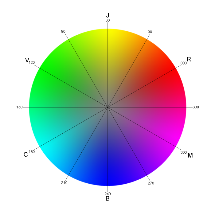
The wheel is built from just a few key colors, which are mixed to create all the others. Let's break down how it's constructed.
Building Blocks of Color
All the colors you see on the wheel start from three fundamental colors. These are the primary colors, and they can't be created by mixing other colors together. In the traditional painter's color model, they are red, yellow, and blue.
Primary Colors: Red, Yellow, Blue
When you mix two primary colors, you get a secondary color.
Mixing a primary color with a neighboring secondary color gives you a tertiary color. Their names are usually hyphenated, like blue-green or red-violet. There are six tertiary colors in total, filling in the gaps on the color wheel.
- Red-Orange
- Yellow-Orange
- Yellow-Green
- Blue-Green
- Blue-Violet
- Red-Violet
Describing Color
Saying a color is "blue" isn't very specific. Is it a bright, vibrant blue like a tropical sky, or a dark, moody navy blue? To describe color accurately, we use three properties: hue, saturation, and value.
Hue
noun
The purest form of a color. Red, yellow, and green are all hues. It's what we typically mean when we just say the word 'color.'
Saturation
noun
The intensity or purity of a hue. A highly saturated color is bright and vivid, while a less saturated color appears more muted, dull, or grayish.
Value
noun
The lightness or darkness of a hue. Adding white to a hue creates a 'tint' (a lighter value), and adding black creates a 'shade' (a darker value).
Color Temperature
Colors can also be described as having a "temperature." This doesn't mean they are physically hot or cold, but it refers to the feeling they evoke. The color wheel can be split into two halves: warm colors and cool colors.
Warm colors are the reds, oranges, and yellows. They are often associated with energy, sunlight, and heat.
Cool colors are the blues, greens, and purples. They can bring to mind feelings of calmness, nature, and water.
Understanding these basic elements is the first step toward using color with confidence. By knowing how colors are made and described, you can make more intentional and effective choices in your work.