Color Theory for Designers
Color Fundamentals
The Dimensions of Color
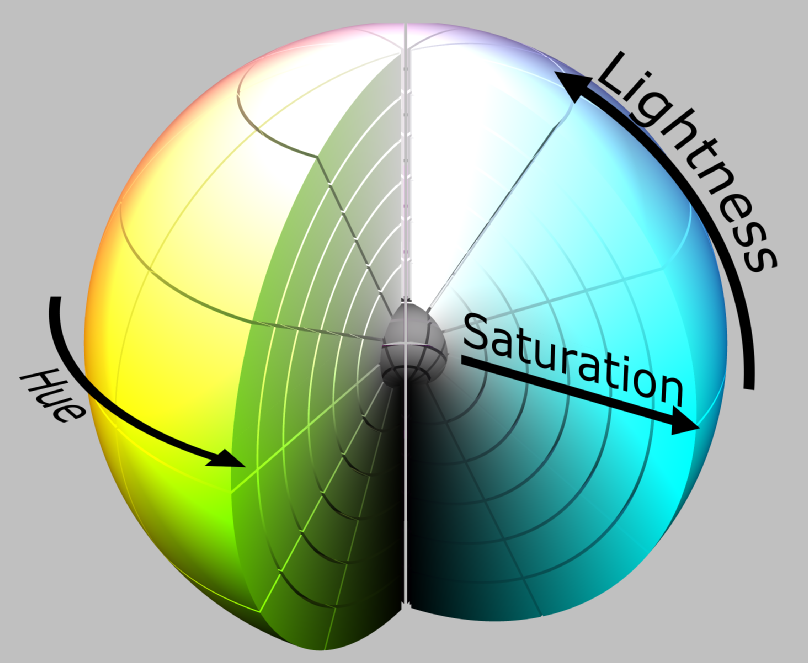
Every color you see can be broken down into three core properties: hue, saturation, and brightness. Understanding these dimensions is the first step to using color effectively. Think of it like a sound mixing board—you have different controls to fine-tune the final output.
Hue
noun
The pure, unadulterated color itself. It's what we typically mean when we say a name like 'red,' 'green,' or 'blue.' Hue is the foundational quality that places a color on the spectrum.
Hue is the most basic property. It’s the specific family of color.
Saturation
noun
The intensity or purity of a hue. A highly saturated color is vivid and rich, while a desaturated color is muted, dull, or grayish.
Think of saturation as a dimmer switch for a color's intensity. Turning it up makes the color pop; turning it down makes it closer to gray.
Brightness
noun
How light or dark a color is, ranging from black to white. This property is also referred to as 'value' or 'lightness.'
Brightness determines a color's proximity to white or black. Together, these three attributes allow us to define any color imaginable.
How We Model Color
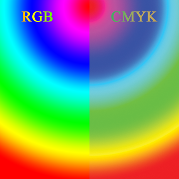
To communicate about color consistently, especially between digital screens and physical printers, we use color models. These are systems for creating a full range of colors from a small set of primary colors. The two main categories are additive and subtractive models.
An additive color model works by combining light. The more light you add, the brighter the color gets. Adding all primary colors together creates white. A subtractive color model works by absorbing light with pigments or inks. The more ink you add, the darker the color gets. Adding all primary colors together creates black.
The most common models you'll encounter are RGB, CMYK, and HSB.
| Model | Full Name | Primary Colors | Primary Use |
|---|---|---|---|
| RGB | Red, Green, Blue | Red, Green, Blue | Digital screens (monitors, phones) |
| CMYK | Cyan, Magenta, Yellow, Key (Black) | Cyan, Magenta, Yellow | Print (books, posters, packaging) |
| HSB | Hue, Saturation, Brightness | Not applicable | Human interface (color pickers) |
RGB is the language of screens. Each pixel on your monitor is a tiny light source composed of red, green, and blue elements. By varying their intensity, a screen can produce millions of colors. When all three are at full intensity, you see white light.
CMYK, on the other hand, is the language of print. It starts with a white surface (like paper) and subtracts light. Cyan, magenta, and yellow inks are layered to absorb different wavelengths of light. In theory, combining C, M, and Y should produce black, but in practice it creates a muddy brown. That's why a separate black ink, or 'Key' (K), is added for deep, true blacks and sharp text.
Finally, the HSB (or HSL/HSV) model is built around human perception. Instead of describing color as a mix of ingredients, it uses the three dimensions we first discussed: hue, saturation, and brightness. This is why most digital color pickers use an HSB interface—it's an intuitive way for us to select and adjust color.
Organizing Hues
The color wheel is a visual tool that maps the relationships between hues. It's a foundational concept in art and design, showing how colors are created by mixing a few basic ones.
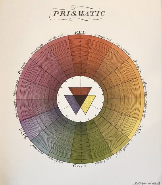
The most traditional color wheel is based on the RYB (Red, Yellow, Blue) model used by painters. While digital and print models use different primaries, the hierarchical relationship remains the same.
Primary Colors These are the foundational hues that cannot be created by mixing other colors. In the traditional artist's wheel, they are Red, Yellow, and Blue.
Secondary Colors These are created by mixing two primary colors.
- Red + Yellow = Orange
- Yellow + Blue = Green
- Blue + Red = Purple
Tertiary Colors These are made by mixing a primary color with an adjacent secondary color. This creates more nuanced shades like red-orange, yellow-green, or blue-purple. They fill the gaps on the color wheel, creating a smooth transition between all the hues.
The color wheel is a fundamental tool in understanding color relationships.
By understanding these properties, models, and relationships, you can begin to make more intentional and effective color choices in any medium.