Cinematic Storytelling: A Creative YouTube Blueprint
Defining Your Visual Signature
Your Visual Signature
Forget traditional branding. For a mind that thrives on novelty but gets bogged down by endless choices, we need a different approach. Instead of a rigid set of logos and brand guidelines, think of your channel's identity as a 'visual signature'—a consistent mood that ties all your varied interests together.
Whether you're filming a travel vlog, a cooking tutorial, or a deep dive into personal growth, this signature ensures everything feels like it comes from the same creator. It's not about forcing different topics into the same box. It's about applying a consistent artistic filter that becomes your unique style. This drastically reduces decision fatigue during production because the big aesthetic choices are already made.
Your signature is the connective tissue for your curiosity. It gives you the freedom to explore any topic without losing your audience.
The Trinity of Mood
Your visual signature is built on three core pillars: colour, typography, and shot style. Nailing these three creates the subconscious familiarity that makes viewers feel at home with your content, no matter the subject.
First, colour. You don't need a complex brand book. Just choose a core of two or three key tones that captures the feeling you want to evoke. Think of filmmakers like Wes Anderson, whose entire mood is communicated through his distinct use of muted pastels. Is your channel's vibe warm and earthy? Maybe you'll lean into ochres, deep greens, and creams. Is it more clinical and focused? Perhaps a palette of cool grey, electric blue, and stark white is a better fit.

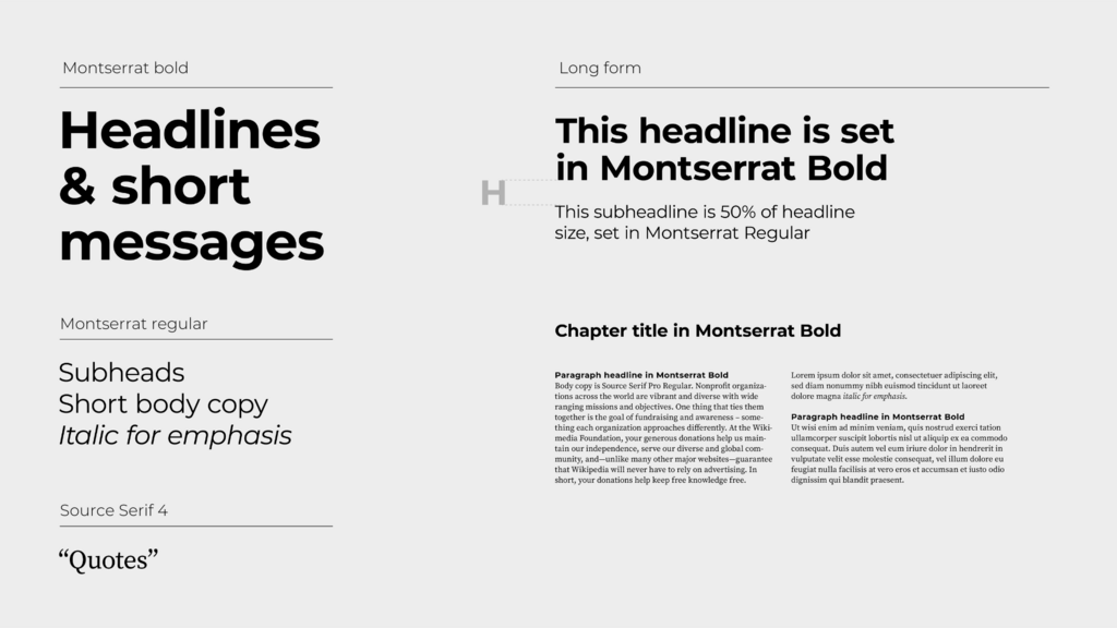
Next is typography. The fonts you use in your thumbnails, titles, and on-screen text have a huge psychological impact. A font, with the little 'feet' on the letters, often feels more traditional, literary, or cinematic. It communicates authority and thoughtfulness. Think of the typeface used for the titles in a classic documentary.
A Sans-serif font, with its clean, modern lines, feels more direct, neutral, or technical. There's no right answer, but the choice should be deliberate. Pick one font for headlines and another for smaller text, and stick with them. This consistency makes your channel instantly recognisable.
Create Your Rulebook
The final step is to codify these choices into a simple guide for yourself. This isn't a restrictive rulebook; it's a 'Visual Bible' designed to free up your creative energy by handling the repetitive decisions.
Start with the 'Three Shot Choice' rule. Instead of feeling overwhelmed by infinite camera angles and movements, choose three core shots that will define your style. For example, your three choices might be:
- A static, wide shot on a tripod. This establishes the scene and feels grounded.
- A handheld, medium shot. This adds a sense of intimacy and human touch.
- A slow, smooth push-in on a detail. This directs the viewer's focus and builds intrigue.
A consistent visual style, color palette, and font choice help your content stand out and become recognizable without relying on a personal appearance.
By limiting your options, you force creativity and develop a distinct look. Combine this with your chosen colour palette and fonts, and put it all on a single page. This document becomes your North Star. When you're in the middle of a project and feeling indecisive, you can simply refer back to your Visual Bible. It keeps you on track and ensures every piece of content, no matter how different, feels uniquely yours.
What is the primary purpose of creating a 'visual signature' instead of traditional branding for a content creator with varied interests?
What are the three core pillars that form the foundation of a channel's 'visual signature'?