Causal Inference for AI
Introduction to Causal Inference
The Limits of Correlation
You’ve probably heard the phrase “correlation is not causation.” It’s a fundamental idea in data analysis, and for good reason. Two things can be strongly linked, or correlated, without one causing the other.
Consider a classic example: in the summer, ice cream sales go up. At the same time, the number of people who drown also increases. If you just looked at the numbers, you’d see a strong correlation. A chart would show both lines rising together. But does eating ice cream cause drowning? Of course not. A hidden factor, the hot weather, causes both. More people buy ice cream when it's hot, and more people go swimming, which unfortunately leads to more drowning incidents. This hidden factor is called a confounding variable.
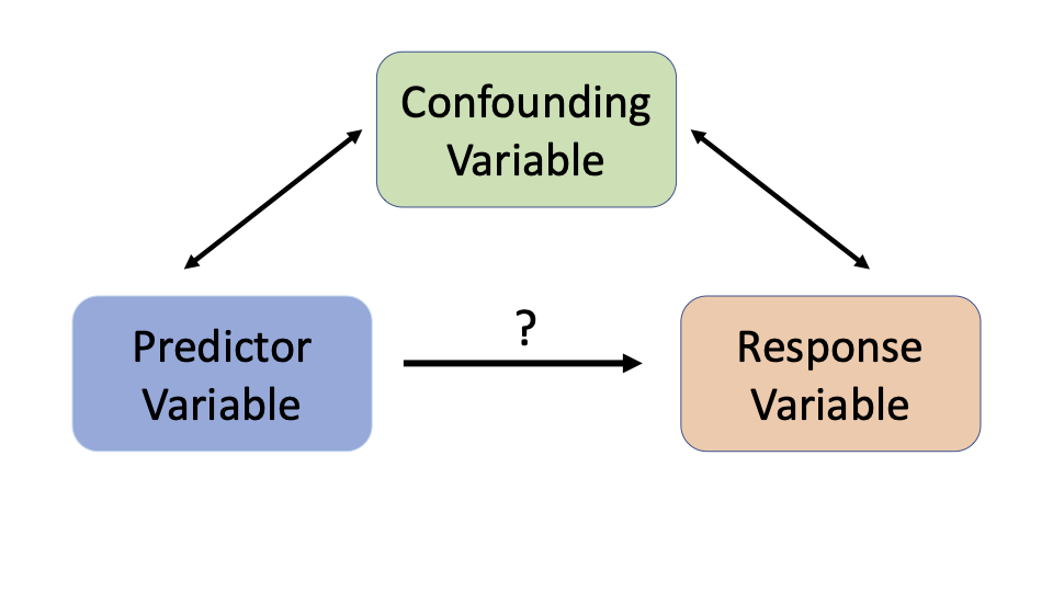
Simply spotting patterns isn't enough to make good decisions. If a city banned ice cream to reduce drownings, it would have no effect. To make effective changes, we need to understand the true cause-and-effect relationships. This is the goal of causal inference.
Causal Inference
noun
The process of drawing a conclusion about a causal connection based on the conditions of the occurrence of an effect.
How We Find the Cause
So how do we move beyond correlation to find causation? The gold standard is the Randomized Controlled Trial (RCT). In an RCT, researchers create two or more groups that are, on average, identical. Then, they apply a treatment (like a new drug) to one group, called the treatment group, and a placebo or standard treatment to the other, the control group.
Because the groups were randomly assigned, any significant difference in outcomes can be attributed to the treatment itself. Randomization washes away the effects of confounding variables, whether we know about them or not. If the group that got the new drug has a much higher recovery rate, we can be confident the drug caused that improvement.
But RCTs aren't always possible. You can't randomly assign people to smoke for 20 years to see if it causes cancer; it's unethical. Sometimes, RCTs are too expensive or impractical. In these cases, we rely on observational studies. We analyze data that has already been collected, like medical records or economic surveys, and use statistical techniques to try and untangle cause from correlation.
The main challenge in observational studies is accounting for confounding variables. Without the power of randomization, we must carefully identify and adjust for factors that could be influencing the results.
Mapping Causal Relationships
To help reason about cause and effect, especially in complex situations, we can use causal graphs. These are simple, intuitive diagrams that show how different variables relate to one another. They're also known as Directed Acyclic Graphs, or DAGs.
In a causal graph, each variable is a node (a circle), and an arrow between two nodes shows a causal relationship. The arrow points from the cause to the effect. For our ice cream example, the graph makes the true relationships instantly clear.
This graph shows that hot weather causes an increase in both ice cream sales and drowning incidents. The link between ice cream and drowning isn't direct; it's a correlation created by a shared cause. By mapping out our assumptions this way, we can identify potential confounders and better design our studies to isolate the true causal effects.
These graphs provide a powerful visual language to discuss, debate, and analyze causal relationships, forming a crucial first step in any rigorous causal analysis.
A study finds a strong positive correlation between ice cream sales and the number of drowning incidents. What is the most likely explanation for this relationship?
In the example of ice cream sales and drowning, hot weather is a hidden factor that influences both variables, creating a misleading correlation. This type of hidden factor is known as a ________.
Understanding the difference between an observed pattern and a true causal link is the foundation of making smart, data-driven decisions.