Canva Report Design Mastery
Understanding Report Design
Designing for Clarity
A report's main job is to communicate information clearly. Good design isn't about fancy graphics or decorations; it's about making your message easy to understand. When a reader can grasp your key points quickly, your report has succeeded. The goal is to make the information accessible, not to simply present data.
Think of good design as a bridge between your data and your audience's understanding. If the bridge is rickety or confusing, your message gets lost.
Every design choice you make should serve the reader. Does this heading make the structure clearer? Does this color highlight the most important finding? If the answer is no, it's probably just visual noise that gets in the way of comprehension.
Structure is Everything
Before you even think about fonts or colors, you need a logical structure. A well-organized report guides the reader through your findings in a natural way. Most effective reports follow a simple, predictable flow.
Most effective reports follow a simple flow: Purpose, Key Findings, Supporting Details, and Next Steps.
This structure puts the most critical information first. It respects the reader's time by giving them the main conclusions right away. They can then choose to dig deeper into the supporting details if they need to. This approach is often called the "inverted pyramid," a concept borrowed from journalism.
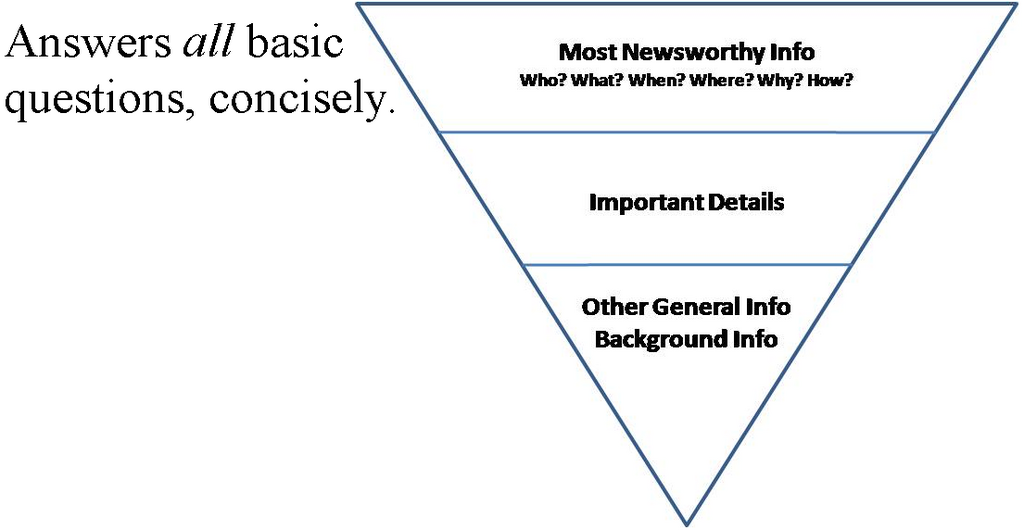
Start with a clear statement of purpose. What question is this report answering? Follow that with your key findings or conclusions. This is your core message. The rest of the report provides the evidence, details, and methodology that back up those findings. Finally, end with clear, actionable next steps.
Guiding the Reader's Eye
Visual hierarchy is how you tell the reader what's important. It's the arrangement of elements to signal their order of significance. You can create a strong visual hierarchy using simple tools:
- Size: Larger elements grab more attention. Your main headline should be bigger than your subheadings.
- Weight: Bolder text stands out. Use bolding strategically for emphasis, not for entire paragraphs.
- Color: A splash of color can draw the eye to a key statistic or finding. But use it sparingly to maintain its power.
- White Space: The empty space around text and visuals is crucial. It prevents the page from looking cluttered and gives readers' eyes a rest, making the content easier to scan.
A clear hierarchy allows a reader to scan your report and understand its structure and key points in seconds. Without it, the page becomes a wall of text that is intimidating and difficult to navigate.
Consistency Creates Cohesion
Consistency is the thread that ties your report together. When visual elements are consistent, the report looks professional and is easier to read. This applies to fonts, colors, and spacing.
Fonts: Stick to one or two readable fonts. A common practice is to use a sans-serif font like Arial, Helvetica, or Open Sans for body text, as they are easier to read on screens. You might use a different, complementary font for headings. Ensure all your main headings are the same size and weight, and do the same for all your subheadings and body text.
Colors: Choose a limited color palette and stick to it. Your colors should have a purpose. For example, one color could be for headings, another for highlighting key data points, and a neutral color for the main text. Ensure your colors have enough contrast to be readable, especially for text.
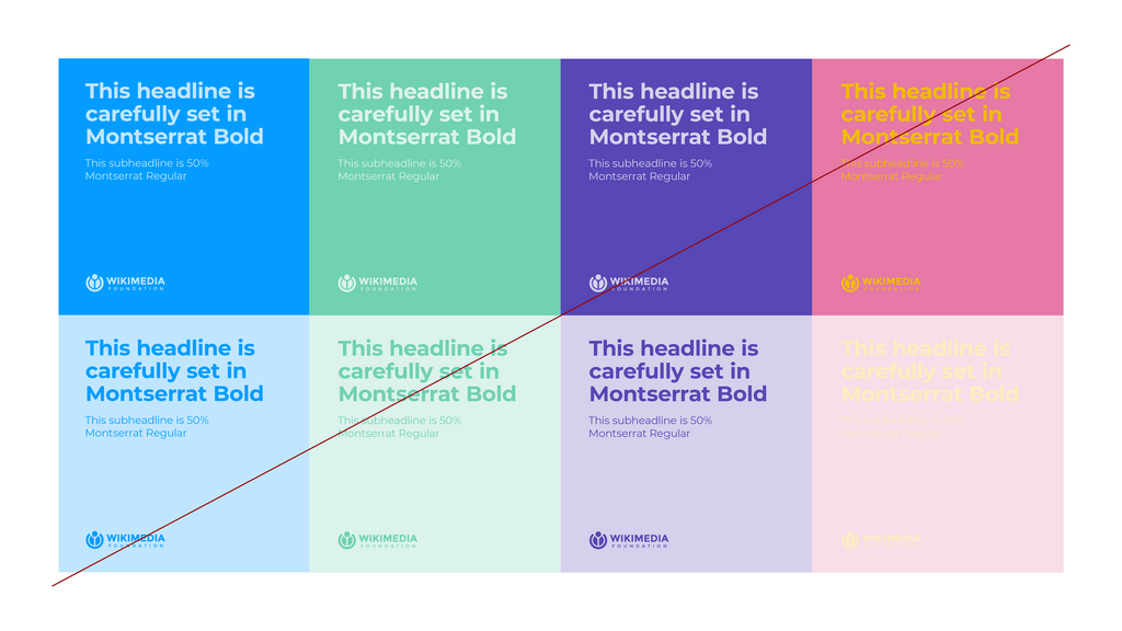
When fonts and colors are applied consistently, your audience doesn't have to waste mental energy figuring out your design system. They can focus entirely on the information you're presenting.
What is the primary goal of good report design?
When structuring a report using the "inverted pyramid" approach, what information should be presented first?
Applying these principles—a logical structure, clear hierarchy, and consistent design—will make your reports more effective and professional.