Candlestick Chart Trading Patterns
Introduction to Candlestick Charts
Reading the Market's Story
Imagine trying to understand a story by only reading the first and last word of each chapter. You'd get a general idea, but you'd miss all the drama and detail. A simple line chart, which just connects closing prices, is a bit like that. It shows you the general trend, but not the story of what happened during each trading period.
Candlestick charts tell a much richer story. Developed in 18th-century Japan by rice traders, they pack a ton of information into a simple shape. Each "candle" represents a specific period of time—a day, an hour, or even a minute—and shows the battle between buyers and sellers during that window.
Anatomy of a Candlestick
At a glance, a candlestick looks like a rectangle with two lines sticking out. But each part has a specific name and tells you something important about the price during that period.
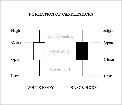
The thick part is called the real body. It shows the range between the price at the start of the period (the open) and the price at the end (the close).
- If the body is green or white, the close was higher than the open. The price went up. This is a bullish candle.
- If the body is red or black, the close was lower than the open. The price went down. This is a bearish candle.
The thin lines above and below the body are the shadows, or wicks. They show the highest and lowest prices the asset reached during the period.
- Upper Shadow: The top of this line is the high price.
- Lower Shadow: The bottom of this line is the low price.
So, in one small shape, a candlestick shows you four key prices: the open, high, low, and close.
Why Candlesticks?
Other chart types exist, but candlesticks are popular for a reason. They offer a quick, visual summary of price action that's more detailed than a line chart and often easier to read than a bar chart.
A bar chart shows the same four price points (open, high, low, close), but it's less intuitive. The open and close are represented by small horizontal ticks on a vertical line. A candlestick's colored body makes the price direction instantly obvious.
| Chart Type | Information Shown | Key Feature |
|---|---|---|
| Line Chart | Closing price only | Shows the general trend over time. |
| Bar Chart | Open, High, Low, Close | More data, but less visual clarity. |
| Candlestick | Open, High, Low, Close | Clearly shows price direction and range. |
By showing the tug-of-war between the opening and closing prices, and how far prices strayed high or low, candlesticks give a glimpse into market sentiment. A long upper wick, for example, might suggest that buyers tried to push the price up, but sellers ultimately forced it back down. This is the kind of story other charts don't tell as clearly.
Now, let's check your understanding of these building blocks.
What part of a candlestick represents the price range between the open and the close for a specific time period?
A red (or black) candlestick signifies that the closing price was lower than the opening price for that period.
Understanding these individual candles is the first step. Later, you'll see how patterns formed by groups of candles can provide even deeper insights.