Advanced Web Design and Functionality
Web Design Principles
Building Blocks of Good Design
Great web design isn't just about making things look good. It's about creating a website that is easy to use, works for everyone, and guides visitors to where they need to go. Think of these principles as the foundation for a strong, effective online presence. They help turn a simple page into a great experience.
A good website has a clear purpose. Every page should help the user achieve their goals in a simple, intuitive way.
Let's start with one of the most important ideas in modern web design: making sure your site works everywhere.
One Site for Every Screen
People browse the web on all sorts of devices: phones, tablets, laptops, and giant desktop monitors. A website that looks great on a desktop might be impossible to use on a phone if the text is tiny and you have to pinch and zoom. This is where responsive design comes in.
Responsive design means your website automatically adjusts its layout to fit the screen it's being viewed on. Text becomes readable, images resize, and menus might change to be more touch-friendly. The goal is to provide a smooth experience for every user, no matter their device.
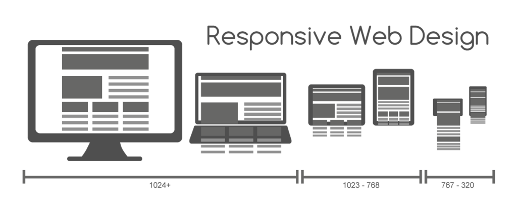
With a responsive design, you build one website that works everywhere. You don't need a separate mobile site. It's an efficient way to ensure your site is usable and professional on any screen.
Guiding Your Visitors
Once someone is on your site, they need to know how to get around. Clear guidance prevents confusion and helps people find what they’re looking for quickly.
Don't make your visitors think. Navigation should feel obvious and effortless.
Intuitive Navigation Good navigation is predictable. Menus should be located where people expect them, like at the top of the page or behind a common “hamburger” icon on mobile. Links should be clearly labeled. If a visitor has to guess where a link will take them, the navigation isn't doing its job.
Minimalist Layouts Less is often more. A cluttered page can overwhelm visitors, making it hard to focus on the most important information. A clean, minimalist layout uses white space (the empty areas on a page) to give content room to breathe. This helps draw attention to key elements, like a button or a headline.
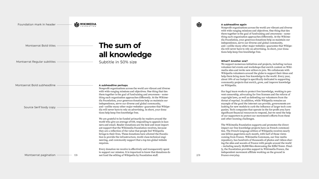
Content Hierarchy Not all information is equally important. Content hierarchy is the art of organizing content to guide the user's eye. The most important heading should be the largest and boldest. Subheadings should be smaller, and paragraph text smaller still. This visual structure tells visitors what to read first and helps them scan the page for relevant information.
Creating a Cohesive Experience
A great website feels consistent and professional. Every element should work together to build trust and communicate your message clearly.
Consistent Branding Your brand's colors, fonts, and logo should be used consistently on every page. This creates a unified experience and reinforces your brand identity. When a user navigates from your homepage to your services page, it should feel like they are still in the same place.
High-Quality Imagery Images and graphics can make a site more engaging, but they must be high quality. Blurry or pixelated images look unprofessional. Choose images that are relevant to your content and help tell your story. Stock photos are fine, but original photography often feels more authentic.
Readability and Typography The text on your site must be easy to read. Choose a clean, simple font and make sure the size is large enough for comfort. There should be enough contrast between the text color and the background color. Long blocks of text should be broken up into shorter paragraphs with clear headings.
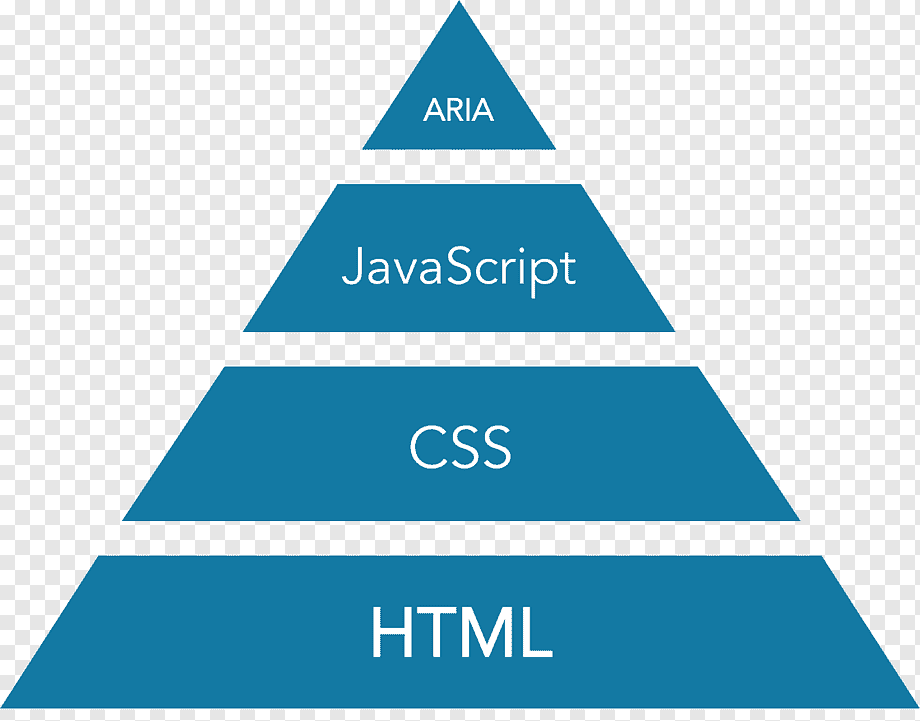
Accessibility Accessibility means designing your website so that people with disabilities can use it. This includes things like adding alternative text to images for screen readers, ensuring your site can be navigated with a keyboard, and using colors that are easy to distinguish for people with color blindness. An accessible site provides a better experience for everyone.
Performance and Action
A well-designed site also needs to be fast and encourage visitors to take action.
Fast Loading Speeds No one likes to wait for a website to load. If your site takes more than a few seconds, visitors are likely to leave and go somewhere else. Optimizing images, using efficient code, and choosing a good web host are all crucial for keeping your site fast.
Effective Calls-to-Action A call-to-action (CTA) is an instruction that prompts the user to take a specific step. This is usually a button or link with action-oriented text like “Learn More,” “Sign Up,” or “Buy Now.” CTAs should stand out visually and make it clear what will happen when the user clicks.
A clear call-to-action turns a passive visitor into an active participant.
By keeping these core principles in mind, you can create a website that not only looks great but is also functional, user-friendly, and effective at achieving its goals.
What is the primary goal of responsive web design?
Using a larger, bolder font for a main headline and a smaller font for subheadings is an example of what design principle?