Advanced User Interface Design Principles
Interaction Design Patterns
Solving Problems Before They Start
Imagine building a house. You wouldn't invent a new way to make a door every time. You'd use a standard, time-tested design that everyone knows how to use. A handle, hinges, and a frame—it just works.
Interaction design patterns are the digital equivalent of that standard door. They are reusable solutions to common usability problems. Instead of reinventing the wheel for every project, designers can rely on these established patterns to create interfaces that are intuitive and easy to navigate.
Design patterns are reusable solutions to common software design problems that help developers build cleaner and more maintainable systems.
Why use them? Patterns help users feel comfortable with a new product right away. When they see a familiar layout or component, they already know how to interact with it. This reduces confusion and helps them achieve their goals faster. For designers, patterns streamline the creative process, freeing up mental energy to focus on the unique challenges of their specific product.
Common Patterns in Action
Design patterns are everywhere in the digital products we use daily. Once you know what to look for, you'll start seeing them all over the place. Let's explore a few of the most fundamental types.
Navigation
noun
The system of menus, links, and other interface elements that allows a user to move between different sections of a website or application.
A core challenge in any interface is helping users find what they need. Navigation patterns solve this by providing a clear and consistent map of the product.
- Top Navigation Bar: Common on websites, it displays the main sections horizontally across the top of the page.
- Sidebar Navigation: A vertical menu on the left or right side, often used for applications with many categories or tools.
- Hamburger Menu: Three horizontal lines that reveal a menu when clicked. It's a popular pattern for mobile apps where screen space is limited.
Next up are forms. Getting information from users, whether for signing up, making a purchase, or providing feedback, is a delicate task. A poorly designed form can be frustrating and cause users to abandon the process entirely.
Good form design patterns include grouping related fields, providing clear labels, and using constraints that prevent errors, like a number pad for a phone number field.
For example, inline validation is a pattern where the form checks for errors as the user types, providing immediate feedback (like a red border on an invalid email) instead of waiting until they hit 'Submit'.
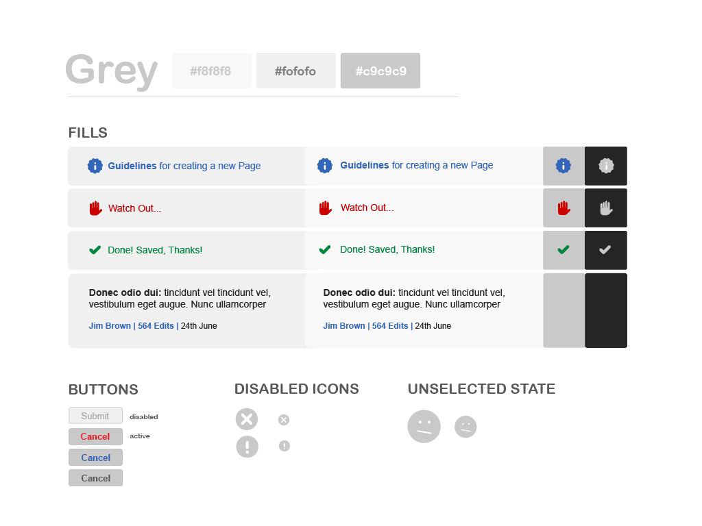
Finally, consider feedback mechanisms. These patterns are all about communication. They inform users about the system's status, acknowledge their actions, and guide them through processes.
Without feedback, users are left wondering if their click registered or if the app has frozen. Simple cues build trust and make the experience feel responsive.
Choosing the Right Pattern
With so many patterns available, how do you pick the right one? The choice always comes back to your users and the specific problem you're trying to solve.
First, understand the context. Who are your users? What are they trying to accomplish? A pattern that works for a complex professional tool might be overkill for a simple mobile game. For instance, a detailed sidebar with sub-menus is great for a feature-rich app, but a simple tab bar at the bottom is better for an app with only a few core functions.
Second, prioritize clarity and efficiency. The best pattern is one that helps the user complete their task with the least amount of friction. If you're designing a checkout form, use patterns that autofill information and break the process into small, manageable steps.
Finally, don't be afraid to test. What seems intuitive to you might be confusing to someone else. Create prototypes and watch real users interact with them. Their feedback will quickly reveal which patterns are working and which need to be reconsidered.
Let's test your knowledge.
What is the primary purpose of an interaction design pattern?
A mobile news app wants to save screen space while still providing access to numerous categories like 'World,' 'Politics,' 'Tech,' and 'Sports.' Which navigation pattern is most commonly used for this situation?
By leveraging these proven solutions, you can create more intuitive, efficient, and user-friendly digital experiences.