Advanced UI Design and Microinteractions
UI Design Fundamentals
Guiding the Eye
When you look at a screen, your eyes don't wander randomly. They follow a path, guided by a designer's choices. This is called visual hierarchy. It's the art of arranging elements to show their order of importance.
Think about it like a conversation. You emphasize important words with your tone of voice. In design, you use size, color, and placement. The biggest, brightest, or most centrally located item on a screen is what people will see first. It’s the headline, the main image, or the primary action button.
By controlling this visual path, you make an interface easier to understand. Users aren't overwhelmed by a jumble of competing elements. Instead, they can quickly scan the page, find what they need, and know what to do next. A clear hierarchy turns confusion into clarity.
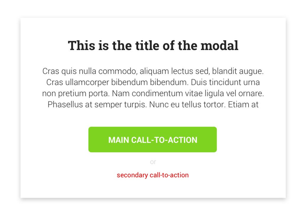
A good hierarchy tells a story. It has a beginning (the most important element), a middle (secondary information), and an end (less critical details).
The Power of Grouping
Our brains are wired to find patterns and create order out of chaos. Without any conscious effort, we group similar items, connect lines, and see whole shapes instead of just parts. These mental shortcuts are described by a set of ideas from psychology called the Gestalt principles.
In UI design, we use these principles to organize information so it feels natural and intuitive. Here are a few key ones:
- Proximity: We see objects that are close to each other as a single group. A button and its label, or an image and its caption, are grouped together in our minds because they are physically close.
- Similarity: We group things that look alike. This is why all the links on a webpage are often the same color and style. Our brain instantly categorizes them as "clickable things."
- Continuity: The human eye prefers to follow continuous paths. We see elements arranged in a line or a gentle curve as a single unit, which helps guide attention smoothly across a page.
By understanding these principles, you can arrange elements in a way that feels logical and uncluttered to the user.
Words as Design
Text isn't just for reading; it's a critical part of the visual design. Typography is how we make written language legible, readable, and appealing when displayed.
Choosing a font is just the start. Good typography establishes a clear hierarchy for information. Just like with visual hierarchy, you use different font sizes, weights (like bold or light), and styles to distinguish between headlines, subheadings, and body text. This helps users scan content quickly.
Readability is also key. Text that is too small, too crowded, or set in long lines is tiring to read. Paying attention to line spacing and length makes the experience comfortable for the user. The goal is to make reading feel effortless, so the user can focus on the message, not the struggle of deciphering it.
Communicating with Color
Color theory is a set of guidelines for combining colors in a way that is harmonious and effective. In UI design, color does more than just make things look good. It communicates meaning, draws attention, and can even influence emotion.
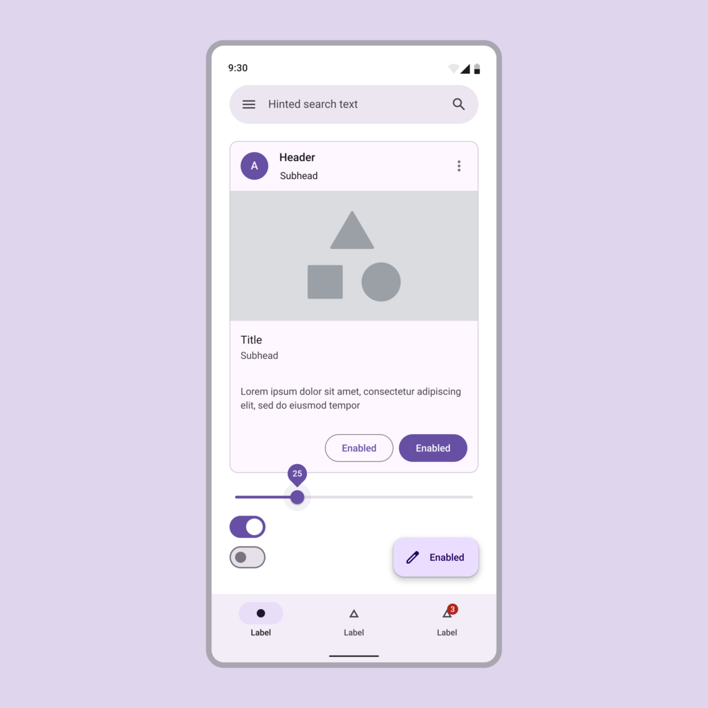
Colors are often used to signal status. Think of how red is commonly used for error messages, green for success, and blue for links. This consistency creates a visual language that users understand instantly, without needing to read any text. A well-chosen color palette reinforces the brand's identity and creates a cohesive, professional look.
However, it's crucial to use color with accessibility in mind. Not everyone sees color the same way. There must be enough contrast between text and its background for everyone to read it clearly. Relying on color alone to convey information can exclude users with color blindness, so it's best to use it in combination with other cues like icons or text labels.
Designers can influence how users interact with the digital product, from the colours of the buttons to the order of information on the page.
Let's test your understanding of these fundamental principles.
What is the primary purpose of establishing a strong visual hierarchy in a user interface?
When a designer makes all the clickable links on a webpage the same shade of blue, which Gestalt principle are they primarily using?
These core principles—hierarchy, grouping, typography, and color—are the building blocks of any effective user interface. Mastering them is the first step toward creating designs that are not only beautiful but also intuitive and easy to use.