Advanced Logo Design Mastery
Logo Design Fundamentals
What Makes a Logo Great?
A logo is a visual handshake. It’s often the first thing people see, and it needs to communicate a lot, very quickly. While creativity is key, the best logos aren't just beautiful, they're built on a foundation of five core principles.
| Principle | Why It Matters |
|---|---|
| Simplicity | Easy to recognize at a glance. Think of the Nike swoosh or the Apple logo. You get it instantly. |
| Memorability | A simple logo is often a memorable one. It should stick in your mind after a single viewing. |
| Timelessness | Trends come and go. A great logo should feel relevant for decades, not just for the current year. |
| Versatility | It needs to look good everywhere, from a giant billboard to a tiny app icon, in color or in black and white. |
| Appropriateness | The logo should match the company's industry and audience. A playful, colorful logo works for a toy company, but not for a law firm. |
These five principles work together. A simple logo is more likely to be memorable, timeless, and versatile. It all starts with keeping it clean.
A Quick Trip Through Time
Logos aren't a new invention. Their roots go back thousands of years to when craftspeople used symbols to mark their goods, like potters pressing a unique seal into their clay. But modern logos truly took off during the Industrial Revolution. With mass production, companies needed a reliable way to distinguish their products from competitors. These early trademarks were often simple, text-based designs.
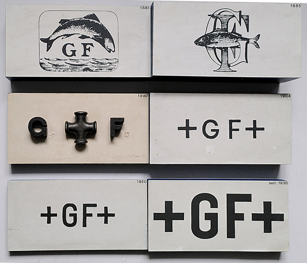
As media evolved from print to television and now to digital screens, logos had to adapt. They became simpler and more abstract, designed to be recognizable even at small sizes on a phone. The journey from complex illustrations to clean, symbolic marks shows a constant drive for clarity and instant recognition.
The Psychology of a Logo
A logo's design isn't arbitrary. Every color and shape is chosen to evoke specific feelings and ideas. This is where psychology meets design.
The creation of logos goes beyond the actual look of it, it dives into the realm of psychology, leveraging consumers perceptions and emotions to create a connection between the brand and the consumers.
Color is one of the most powerful tools. Our brains are hardwired to respond to colors in different ways. A splash of red can signal excitement or urgency, while a cool blue can feel calm and trustworthy. Designers choose colors carefully to align the logo with the brand’s intended feeling.
Shapes work in a similar way. Soft, rounded shapes often feel friendly and inclusive, while sharp, angular shapes can communicate strength and precision. By combining the right shapes and colors, a designer can craft a logo that speaks to its audience on a subconscious level.
The Heart of the Brand
It’s easy to think a logo is the brand, but that’s not quite right. A brand is the entire experience a customer has with a company. It’s the product, the customer service, the reputation, and the values. The logo is the symbol for all of that, a shortcut to the bigger picture.

A great logo acts as a vessel for the brand's meaning. When you see it, you should instantly recall your experiences and feelings about the company. It builds recognition, creates a sense of consistency, and helps a business stand out in a crowded market. It’s not the whole story, but it’s the cover of the book.
Now that you understand the core principles and psychological impact of logos, let's review the key concepts.
Ready to test your knowledge? Let's see what you've learned about the fundamentals of logo design.
According to the text, when did the use of modern logos become widespread?
What is the primary relationship between a logo and a brand?
Understanding these fundamentals is the first step toward creating or evaluating a visual identity. A logo is small but mighty, carrying the weight of a brand in a single, simple mark.