Advanced Graphic Design Principles
Strategic Visual Hierarchy
Guiding the Viewer's Eye
You already know that making something bigger or brighter draws attention. But strategic visual hierarchy is less about shouting and more about telling a story. It's the art of guiding a viewer's eye through a layout in a specific, intentional sequence. Instead of just presenting information, you're controlling the narrative.
Our eyes don't wander randomly; they follow predictable paths, especially when scanning new content. The two most common paths are the F-Pattern and the Z-Pattern. Understanding these helps you place key information exactly where users are most likely to look.
The F-Pattern is common on text-heavy pages like blog posts or news articles. Readers scan the top headline, then jump down and read a bit of the next line, then scan the left edge of the content. You should place your most important information along this 'F' shape.
The Z-Pattern applies to simpler, more visual layouts. The eye moves from top-left (logo) to top-right (secondary call-to-action), then diagonally to the bottom-left (supporting image or text), and finally to the bottom-right (the main call-to-action). This is perfect for landing pages and ads.
Grouping Without Borders
Once you have a scanning pattern in mind, you need to group related items so the brain processes them as a single unit. You could draw boxes around everything, but that creates clutter. A more elegant solution is to use —subtle psychological cues that tell our brains how to connect the dots.
- Proximity: Placing elements close together makes them feel related. A button and its label, or an image and its caption, should be a tight unit.
- Similarity: Elements that look similar are perceived as having a similar function. Using the same colour, shape, or font for all your buttons tells the user, "These all do the same kind of thing."
- Continuity: The eye tends to follow lines and curves. You can arrange elements along an implied line to guide attention from one section to another smoothly.
Good design relies on visual cues, not just explicit containers. Proximity and similarity can group elements more effectively than a line or a box.
The most powerful grouping tool is often what isn't there: . This negative space isn't empty; it's a functional element. Generous white space around a cluster of items isolates it from other elements, creating a strong sense of grouping and focus. It reduces cognitive load by giving the brain visual breathing room, making the entire layout feel calmer and easier to parse.
Creating Dynamic Layouts
A well-structured layout is clear, but it can also be static. To make a design engaging and hold a viewer's attention, you need to introduce a sense of energy or movement. Two subtle but powerful techniques for this are the and implied movement.
The Rule of Odds suggests that an odd number of elements in a group is more visually appealing than an even number. A group of three or five objects creates a more dynamic composition because our brain can't easily pair them up, forcing our eyes to move around the group. It creates a natural focal point in the middle element.
Implied movement uses visual cues to direct the eye in a specific direction. This can be literal, like an arrow or a pointing finger, but it's often more subtle. A person's gaze in a photograph will naturally draw your eye in the same direction. Diagonal lines, whether explicit or formed by the alignment of elements, create a sense of motion and energy far more effectively than rigid horizontal or vertical lines.
Building the Architecture
All these techniques—scanning patterns, Gestalt grouping, and dynamic composition—serve a single master: information architecture. This is the practice of classifying your content into different levels of importance. Every successful design has a clear hierarchy of focal points.
- Primary: This is the first thing the user should see. It's the headline, the hero image, the most important piece of data. It should be visually dominant.
- Secondary: These are the elements of next importance. They support the primary element, providing context or secondary actions. This could be subheadings, introductory text, or secondary buttons.
- Tertiary: This is the least critical information. Think footer links, copyright notices, or supplementary details. It should be present but not distracting.
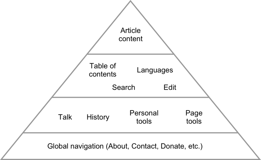
By using size, colour, placement, and white space, you define this hierarchy. Your primary element might be large and centred. Secondary elements might be smaller and grouped using proximity. Tertiary elements might be small, low-contrast, and placed at the edges of the layout, following a natural scanning pattern. This transforms a simple layout into a strategic tool that communicates effectively and efficiently.
Let's test what you've learned about structuring information.
What is the primary purpose of strategic visual hierarchy in design?
You are designing a text-heavy blog post. According to common scanning patterns, where should you place your most crucial information?
Mastering these principles allows you to control the conversation with your viewer, ensuring your message is not just seen, but understood in the order you intend.