Advanced Graphic Design Mastery
Advanced Design Principles
Beyond Symmetry
You already know that balance isn't just about perfect symmetry. In complex designs, achieving balance is a dynamic act. It's about distributing visual weight to create a sense of stability, even when the elements are wildly different. Think beyond the simple scales of symmetrical and asymmetrical balance and consider more nuanced approaches.
Radial balance, where elements radiate from a central point, creates a strong focal point and a feeling of movement. Imagine a sunburst or the ripples in a pond. Crystallographic balance, or mosaic balance, involves creating a grid of similarly weighted elements. There's no single focal point; instead, the eye is invited to scan across the composition, finding interest everywhere. This is common in patterns, textiles, and busy web page backgrounds.
The key is to manipulate visual weight with a sophisticated touch. Weight isn't just determined by size and color. An element's perceived weight is also affected by its complexity, texture, orientation, and the negative space surrounding it. A small, intricate element can easily balance a large, simple shape. A vibrant, warm color feels heavier than a cool, muted one.
Creating Depth with Contrast
In advanced applications, contrast is more than just making text readable on a background. It's a tool for creating depth, emotion, and directing attention with precision. Move beyond the obvious contrasts of light/dark and large/small. Think about how you can layer different types of contrast to build a richer visual experience.
Combine contrasting typography—a heavy, geometric headline with a light, airy serif for body text. Juxtapose organic, hand-drawn shapes with crisp, rigid geometric ones. Mix smooth, clean vector graphics with grainy, textured photography. Each layer of contrast adds a new level of interest and helps to separate information, guiding the user through the design without needing overt signals like boxes and lines.
Subtle contrast can be more powerful than strong contrast. A slight shift in hue or saturation can define a space or highlight an interactive element without shouting for attention.
Navigating Complex Hierarchies
For a simple poster, creating hierarchy might be as easy as making the title bigger. But in a data-dense dashboard or a multi-page report, hierarchy is a complex system. You can't just make everything that's important bigger, or you'll end up with a cluttered mess. Advanced hierarchy is about establishing clear primary, secondary, and tertiary levels of information through a consistent set of rules.
Your primary level is for the most critical information—the key metric, the main navigation, the page title. It should be immediately obvious. The secondary level provides context and supporting details. Tertiary information is the fine print, the nice-to-know details that can be tucked away. Use a combination of size, color, white space, and placement to define these levels. A user should be able to understand the structure and importance of information at a glance, long before they start reading.
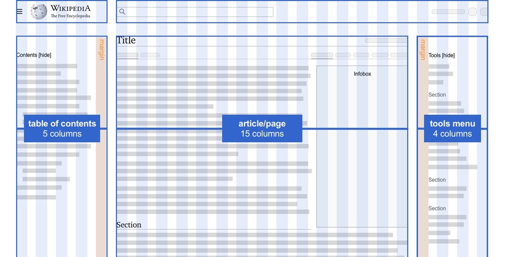
This doesn't mean rigidly adhering to three levels. A design might have five or more. The point is to create a clear, predictable path for the user's eye to follow. Their journey through your information should feel effortless and intuitive.
Rhythm, Repetition, and Identity
Repetition creates unity, but its advanced use is in building rhythm and brand identity. It’s not about copying and pasting the same button style everywhere. It's about creating a visual language.
Think of a simple shape from a logo. That shape can be echoed as a faint background pattern, used as a container for a photo, or transformed into a set of custom icons. This strategic repetition creates a cohesive experience that feels intentional and strengthens brand recognition. It’s the difference between a collection of screens and a unified product.
This also creates a visual rhythm. The spacing between elements, the pattern of headlines, the cadence of images—these repeating patterns make a design feel predictable and harmonious. When you intentionally break that rhythm, you create emphasis and draw attention to a specific element.
Finally, let's talk about white space. In complex layouts, white space—or negative space—is the glue that holds everything together. It’s not just empty background; it’s an active element. More white space around an object increases its perceived importance and gives it room to breathe. Grouping elements with tight internal white space and generous external white space is the core of the principle of proximity. It allows you to create clear relationships and groupings without adding a single line or box. In a busy interface, generous and consistent use of white space is the most effective tool for reducing cognitive load and creating a sense of calm and order.
Which type of balance is characterized by a grid-like layout where visual weight is distributed evenly, encouraging the eye to scan the entire composition rather than focusing on a single point?
In a complex dashboard design, what is the most effective way to establish a clear hierarchy for primary, secondary, and tertiary information?
Applying these principles with nuance is what separates good design from great design. It's about moving from following rules to conducting a visual orchestra.