Advanced Digital Accessibility Implementation
WCAG 2.2 New Criteria
What's New in WCAG 2.2
The Web Content Accessibility Guidelines (WCAG) have evolved. Version 2.2 introduces nine new success criteria that target modern web challenges, particularly for users with motor and cognitive disabilities. These updates move beyond foundational principles to address specific usability hurdles found on today's sites and apps. Let's break down what's new and how to implement it.
Keeping Focus Visible
One of the most common accessibility issues on modern websites is the “sticky” header or footer. These elements remain fixed at the top or bottom of the viewport as the user scrolls. While they offer convenient navigation, they often obscure content, especially for keyboard-only users. When a user tabs to an interactive element hidden behind a sticky banner, they lose their place entirely.
WCAG 2.2 addresses this directly with two new criteria:
- 2.4.11 Focus Not Obscured (Minimum) (AA): At least part of the focused component must be visible.
- 2.4.12 Focus Not Obscured (Enhanced) (AAA): The entire focused component must be visible.
Meeting the AA standard is now essential. If your site has a sticky footer, a chat widget, or a non-dismissible cookie banner, you must ensure it never completely covers the element that currently has keyboard focus. The browser’s default behavior is to scroll the focused element into view, but sticky elements can override this. You may need custom JavaScript to detect the position of a focused element and adjust the scroll position to keep it visible.
Also new is 2.4.13 Focus Appearance (AAA), which dictates how the focus indicator should look. To meet this highest level of conformance, a focus indicator must:
- Have a minimum contrast ratio of 3:1 against adjacent colors.
- Enclose the component and have a thickness of at least 2 if it's a solid outline.
This pushes designers and developers to create focus states that are impossible to miss, which benefits all users, not just those with visual impairments.
Easier Interactions
Many modern interfaces rely on complex gestures that can be difficult or impossible for users with motor impairments. Two new criteria aim to simplify these interactions.
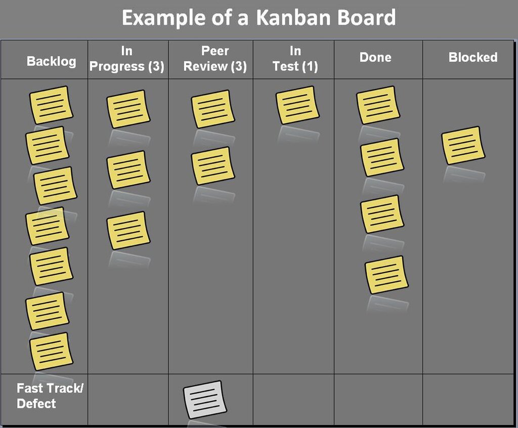
2.5.7 Dragging Movements (AA) requires that any action using a dragging motion, like using a slider or moving items on a Kanban board, must have a single-pointer alternative that doesn't require dragging. For a price-range slider, this could mean adding input fields where users can type the minimum and maximum values. For a Kanban board, you could add buttons to each card that open a menu to move it to another column.
2.5.8 Target Size (Minimum) (AA) mandates that interactive targets must be at least 24 by 24 CSS pixels in size. This is crucial for users with motor impairments who may have difficulty with precise clicks, as well as anyone using a touch screen. There are exceptions, such as for links within a block of text or where the smaller size is essential. But for standalone icons, buttons, and other controls, bigger is better. If you can't make the visible icon larger for design reasons, you can use padding to increase the clickable area to meet the 24x24 requirement.
Reducing Cognitive Load
The final set of new criteria focuses on making websites less mentally taxing, especially for users with cognitive or memory-related disabilities.
3.3.7 Consistent Help (A) is a simple but powerful rule: if a site provides a help mechanism, like a contact link, chatbot, or FAQ, it must be in the same relative place on every page. This creates predictability and reduces the effort required to find help when it's needed.
3.3.8 Redundant Entry (A) prevents users from having to enter the same information more than once during a single session. For example, in a multi-page checkout process, if the user enters their shipping address, it should be automatically available to use as the billing address. This supports users with memory difficulties and reduces frustration for everyone.
Think of it this way: the user's brain is not your storage device. If you've asked for a piece of information once, remember it for them.
Finally, 3.3.9 Accessible Authentication (Minimum) (AA) tackles frustrating and inaccessible login processes. It prohibits authentication methods that rely on a cognitive function test—like memorizing a username and password, transcribing characters, or solving a puzzle—unless an alternative is available.
Allowing users to use a password manager is a common way to meet this requirement. Other compliant methods include 'magic link' logins sent via email or using third-party authentication like 'Log in with Google'. The goal is to ensure that a user doesn't have to rely on memory or complex cognitive tasks just to access their account.
Now, let's test your understanding of these new success criteria.
A website has a 'sticky' footer that remains at the bottom of the screen. When a keyboard user tabs to a link at the very bottom of the page's main content, the sticky footer covers the link completely. Which new WCAG 2.2 success criterion does this scenario fail?
To comply with WCAG 2.2's 2.5.8 Target Size (Minimum) criterion, what is the minimum size for a standalone interactive target, such as an icon button?
By integrating these new criteria into your workflow, you can create digital experiences that are more usable and inclusive for everyone, reflecting the evolving ways people interact with the web.