Advanced Design Systems Bootcamp
Complex Visual Hierarchy
The Invisible Hand
You already know that visual hierarchy guides a user's attention. But it's more than just making headlines bigger. Think of it as an invisible hand, subtly leading a user from the most important element to the least, creating a seamless and intuitive path through your interface.
This goes beyond simply picking font sizes. A sophisticated hierarchy uses a consistent mathematical scale. By choosing a ratio, like 1.250 (major third) or 1.333 (perfect fourth), you can systematically determine the size of your H1s, H2s, body copy, and captions. This creates a natural rhythm that feels intentional and harmonious, rather than arbitrary.
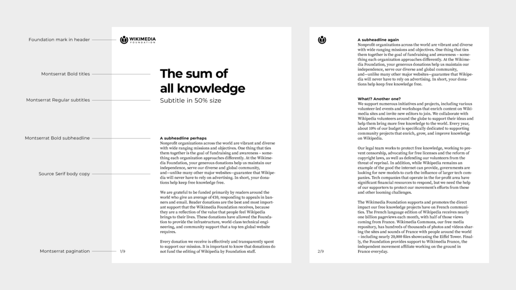
Consistent scaling removes guesswork and builds a clear, predictable structure that users can navigate instinctively.
Directing Focus
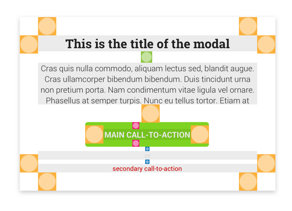
Color and contrast are your power tools for creating focal points. Instead of just making a design look good, use high-contrast color pops strategically. This technique acts like a spotlight, drawing the eye directly to critical actions, such as a "Sign Up" or "Add to Cart" button. A bright, isolated color tells the user exactly where to look when they're ready to act.
You can also use directional cues to guide attention. Obvious cues include arrows or lines, but subtle ones are often more powerful. The direction of a person's glance in a photo, for example, is a powerful implicit cue. We are naturally wired to look where others are looking. This effect can be used to direct a user's focus toward a key feature or call-to-action without ever drawing an arrow.
Predictable Paths
Users don't read web pages; they scan them in predictable patterns. Eye-tracking studies have revealed two common paths that you can design for: the F-pattern and the Z-pattern.
The describes how users scan content-heavy pages like articles or search results. They read horizontally across the top, then scan down the left side of the page, occasionally darting out to read an interesting subheading or bolded phrase. To accommodate this, place your most important information in the top two horizontal rows and use clear headings and bullet points down the left side to catch their scanning eye.
The is more common on simpler, less text-heavy pages like landing pages. The eye moves from top-left (logo) to top-right (navigation), then sweeps diagonally down to the bottom-left, and finally moves across to the bottom-right, where the primary call-to-action often sits. By placing your most important elements along this path, you align your design with the user's natural scanning behavior.
Grouping and Hiding
Beyond individual elements, hierarchy organizes entire sections. You can create strong visual groupings through proximity, placing related items close together, and using alignment to create clean, implied lines that guide the eye. This creates a sense of order and makes complex information feel manageable.
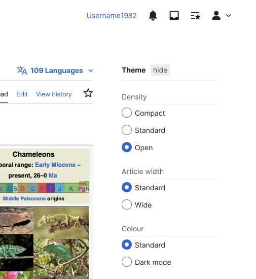
For very dense interfaces, you can't show everything at once. This is where comes in. It's a technique where you reveal information gradually, showing only what's necessary for the current step. Advanced settings, for example, are often hidden behind a toggle or link. This reduces cognitive load by hiding complexity until the user explicitly asks for it, keeping the primary interface clean and focused.
Ready to test your understanding of these advanced hierarchy techniques?
When creating a typographic scale for a user interface, what is the primary benefit of using a consistent mathematical ratio (e.g., 1.250)?
You are designing a simple landing page with a logo, a main navigation menu, a large central image, and a primary call-to-action button. Which scanning pattern is a user most likely to follow?
Mastering these principles allows you to design interfaces that are not just visually appealing, but are also clear, intuitive, and effective at guiding users toward their goals.