Advanced Color Theory for Clothing
Fabric and Light
Texture Is a Lens for Color
You've chosen the perfect emerald green. But on a silk camisole, it looks electric and vibrant. The same dye on a cashmere sweater appears softer, deeper, and more subdued. The color hasn't changed, but its vessel has. Fabric texture acts like a lens, bending, scattering, or reflecting light to fundamentally alter how we perceive a hue.
At the heart of this phenomenon is a simple principle: light reflection versus absorption. Smooth, lustrous surfaces like silk or satin have tightly packed, uniform fibers that act like tiny mirrors. They bounce a high percentage of light directly back to the viewer's eye, making the color appear brighter and more saturated. Think of a calm lake perfectly reflecting the sky.
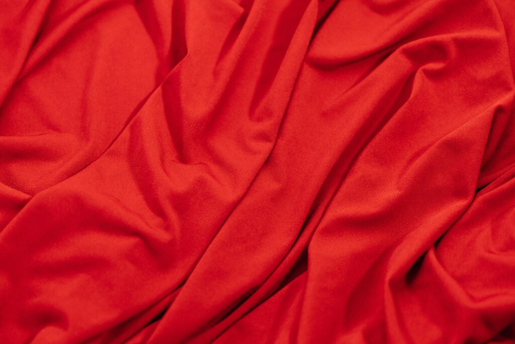
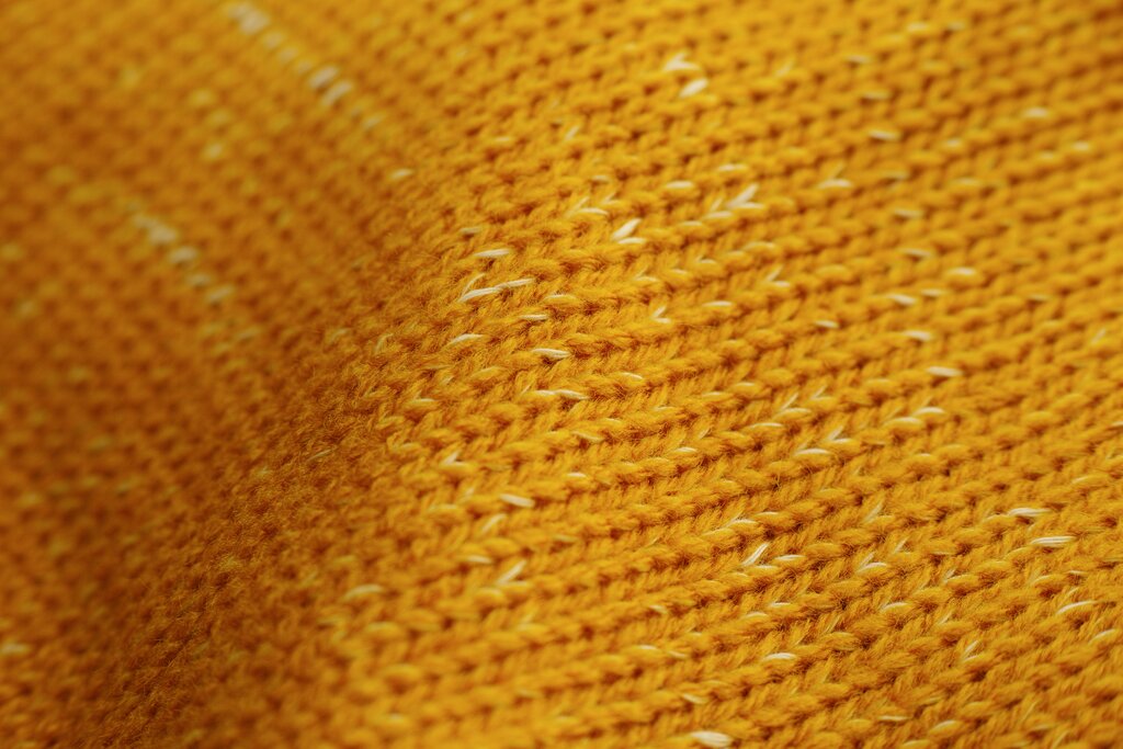
Conversely, fabrics with a rough or uneven texture, such as wool, linen, or flannel, have fibers that go in many directions. These surfaces create countless microscopic shadows and trap light rather than reflecting it. This absorption mutes the color, giving it a softer, more grounded appearance. This is like the choppy surface of the same lake, which breaks up the reflection into a darker, more complex pattern.
From Optical Depth to Mood
The structure of a weave itself adds another layer of complexity. This is where we consider optical depth, the perceived richness and dimension of a color based on how light interacts with the fabric's construction. A simple, flat plain weave presents color straightforwardly. But a more complex weave, like a twill or a jacquard, creates subtle patterns of light and shadow within the fabric itself. A navy twill, for instance, has a diagonal ribbing that catches light differently, giving the color a sense of depth that a plain navy poplin would lack.
This interplay of texture and light has a direct psychological impact. It shapes the 'mood' of a color. A shiny red might feel energetic, passionate, or even aggressive. A matte red, like that of a brushed flannel shirt, feels cozy, approachable, and warm. As a stylist, you're not just choosing a color; you're choosing a finish. The texture dictates whether an outfit feels formal and sharp or relaxed and intimate. A high-shine finish often reads as more formal and deliberate, while a matte finish lends an air of effortless authenticity.
Consider a black tuxedo. The satin lapels stand out against the matte wool body precisely because of this contrast in light reflection, adding formal dimension without introducing a new color.
Lighting Changes Everything
A fabric's appearance isn't static. It changes dramatically depending on the lighting environment. The same garment can look completely different under the harsh, cool fluorescent lights of an office compared to the warm, diffused light of the golden hour at sunset. This phenomenon, known as metamerism, is a critical consideration for any stylist. A color match that looks perfect under a store's halogen bulbs might appear mismatched in natural daylight.
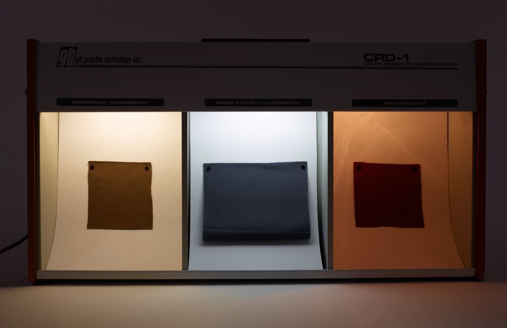
Artificial lighting, especially fluorescent, tends to be cool and can wash out warmer tones or give a greenish cast to blues and grays. Natural sunlight, particularly the warm light of early morning or late afternoon, enriches reds, oranges, and yellows while softening cooler hues. When advising a client, always ask about the context in which the garment will be worn. An outfit for an outdoor wedding requires different texture and color considerations than one for a corporate conference room. The best practice is to view fabric swatches under multiple light sources—near a window, under indoor lighting, and even with a phone's flashlight—to get a true sense of their versatility.
Why does the same green dye appear more vibrant on silk than on cashmere?
The phenomenon where a color appears different under various lighting conditions, such as fluorescent office light versus natural daylight, is known as: