Advanced Color Grading Mastery
Color Theory Basics
The Color Wheel
Before you can grade a photo, you need to understand how colors relate to each other. The most fundamental tool for this is the color wheel. It’s a visual map that organizes colors and shows their relationships, making it easier to see what works and what doesn't.
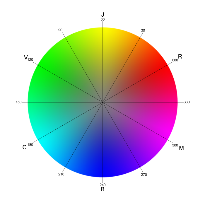
The wheel is built from just three foundational colors that can't be created by mixing others. These are the primary colors: red, yellow, and blue.
When you mix two primary colors, you get secondary colors:
- Red + Yellow = Orange
- Yellow + Blue = Green
- Blue + Red = Purple
Mixing a primary color with a neighboring secondary color gives you a tertiary color. These have two-word names, like red-orange, yellow-green, or blue-purple. Together, these three sets of colors make up the basic 12-hue color wheel.
Creating Harmony
Knowing how colors are made is the first step. The next is knowing how to combine them. A color scheme is a planned combination of colors used in a piece of art or design. There are many types, but two of the most common are complementary and analogous.
Complementary colors are opposites on the color wheel. This pairing creates high contrast and makes colors look brighter and more intense. Think red and green, blue and orange, or yellow and purple. They grab attention but can be overwhelming if not balanced.
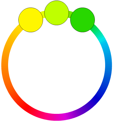
Analogous colors sit next to each other on the color wheel. These schemes use two to four colors that are neighbors, like yellow, yellow-green, and green. This creates a sense of harmony and unity. Since the colors are similar, the result is often serene and comfortable, like scenes found in nature.
The Feeling of Color
Beyond technical relationships, colors carry emotional weight. This is often called color psychology. The colors you choose for your photo can dramatically change the mood and message it conveys. A sunny beach scene graded with cool blues will feel very different than one with warm, golden tones.
While personal and cultural experiences can change how a color is perceived, there are some widely shared associations in Western cultures.
Color psychology explores the psychological and emotional effects of colors on human behavior.
| Color | Common Associations |
|---|---|
| Red | Passion, love, anger, energy, danger |
| Orange | Enthusiasm, creativity, warmth, excitement |
| Yellow | Happiness, optimism, warmth, caution |
| Green | Nature, growth, harmony, jealousy, health |
| Blue | Calmness, sadness, stability, trust |
| Purple | Royalty, luxury, mystery, spirituality |
These aren't strict rules, but they are powerful starting points. As you begin color grading, think about the story you want to tell. Do you want the image to feel energetic and exciting? Or calm and peaceful? Your choice of colors is one of your most powerful tools to guide the viewer's feelings.
Time to check your understanding of these core concepts.
Which of the following are the primary colors?
Mixing a primary color with a neighboring secondary color creates a ________ color.
With these fundamentals of color theory, you're now ready to explore how to apply them in practice.