Advanced Autumn Medium Personal Style
Color Theory Basics
The Color Wheel
The color wheel is a visual tool that helps us understand the relationships between colors. It organizes colors in a circle to show how they are related. Think of it as a map for color. By understanding this map, you can navigate the world of color with confidence, whether you're choosing an outfit, decorating a room, or painting a picture.
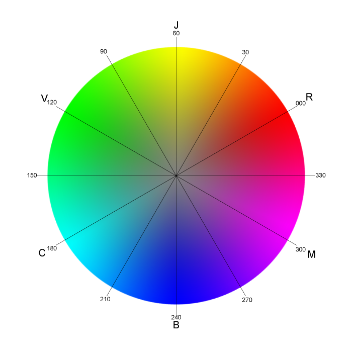
The wheel isn't just a random assortment of hues. Its structure is based on a set of core colors that can be mixed to create all other colors. These are the building blocks of everything we see.
Building Blocks of Color
All the colors on the wheel can be broken down into three fundamental categories.
Primary Colors
noun
The three foundational colors from which all other colors are mixed. They cannot be created by mixing other colors together.
Next up are the secondary colors. These are created by mixing equal parts of two primary colors.
| Primary 1 | Primary 2 | Secondary Color |
|---|---|---|
| Red | Yellow | Orange |
| Yellow | Blue | Green |
| Blue | Red | Purple |
Finally, we have tertiary colors. These are the shades that fill in the rest of the color wheel. You get them by mixing a primary color with an adjacent secondary color. This creates more nuanced hues like red-orange, yellow-green, and blue-violet. These are the in-between colors that add richness and variety.
Color Harmony and Psychology
So, why does this all matter? Because the relationships on the color wheel help us create color harmony. This is the theory of pairing colors in a way that is pleasing to the eye.
One of the simplest forms of harmony comes from using complementary colors. These are colors that sit directly opposite each other on the color wheel. The high contrast between them creates a vibrant, energetic look. For example, blue and orange are complementary. So are red and green.
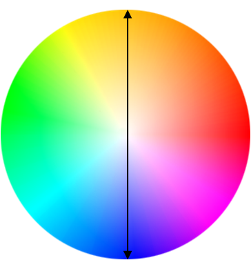
Beyond visual harmony, colors also carry psychological weight. They can influence our moods and perceptions in subtle ways. This is often called color psychology. While reactions to color can be personal and cultural, some general associations are common in Western cultures.
| Color | Common Associations |
|---|---|
| Red | Energy, passion, danger, excitement |
| Blue | Calm, trust, sadness, stability |
| Yellow | Happiness, optimism, warmth, warning |
| Green | Nature, growth, harmony, health |
| Purple | Royalty, luxury, creativity, mystery |
| Orange | Enthusiasm, friendliness, energy |
Understanding these associations can help you use color to communicate a specific feeling or message. A blue room might feel calming and peaceful, while a splash of yellow can make a space feel more cheerful and bright.
With a grasp of the color wheel, its components, and the feelings colors can evoke, you have the foundational tools to start making more intentional and effective color choices.
What are the fundamental 'building block' colors from which all other colors on the wheel are mixed?
How do you create a secondary color like green?