Advanced Airport Data Visualization
Data Visualization Fundamentals
Turning Data into Stories
Raw data is just a collection of facts and figures. On its own, it can be overwhelming and difficult to understand. Data visualization transforms this raw material into a clear, visual story that our brains can process quickly.
The goal isn't just to create a pretty picture; it's to communicate insights, reveal patterns, and make complex information understandable at a glance. A well-crafted visualization can highlight a trend or expose an outlier in ways that a spreadsheet of numbers never could. It's about turning data into decisions.
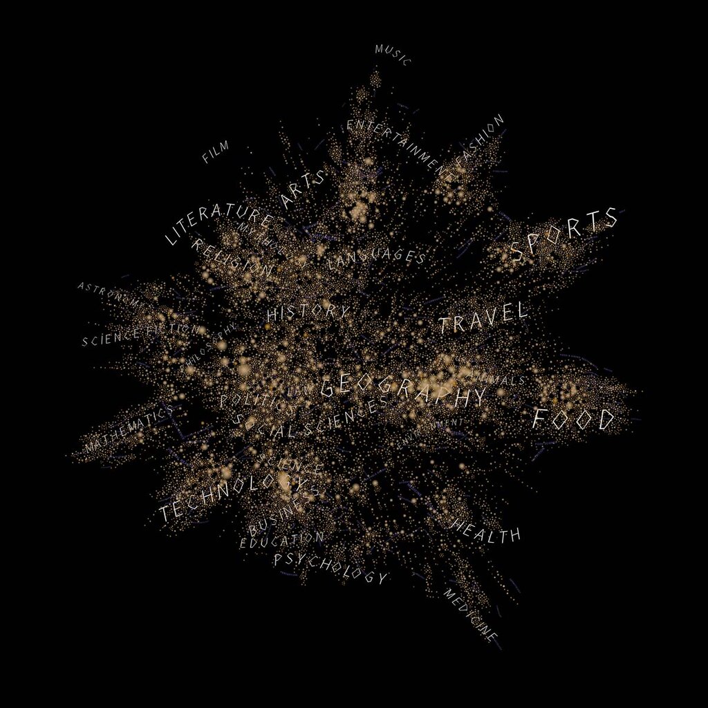
Effective visualization rests on a few key principles. You need to know your audience, understand the message you want to convey, and choose the right visual form to express that message clearly and accurately.
Choosing the Right Tool
The first step in creating an effective visualization is selecting the right chart type. Different charts are designed to answer different questions. Are you comparing values? Showing a trend over time? Understanding the relationship between two variables? Your answer determines which chart you should use.
| Chart Type | Primary Use | Example Question |
|---|---|---|
| Bar Chart | Comparing categories | Which product had the highest sales last quarter? |
| Line Chart | Showing trends over time | How has our website traffic changed over the last year? |
| Scatter Plot | Revealing relationships | Is there a correlation between ad spending and sales? |
| Pie Chart | Showing parts of a whole | What percentage of our budget goes to each department? |
| Histogram | Showing data distribution | How are customer ages distributed? |
Choosing incorrectly can mislead your audience. For example, using a pie chart to compare performance across many categories becomes a cluttered mess. A bar chart would be much clearer. Similarly, a line chart is perfect for continuous data, like temperature over a month, but a bar chart is better for discrete categories, like sales figures for different countries.
Designing for Clarity
Once you've chosen the right chart, design principles come into play. The goal is to make your visualization as easy to read as possible. This means paying attention to color, minimizing clutter, and using labels effectively. Every element on the chart should serve a purpose. If it doesn't add to the understanding, it's probably just noise.
One useful concept is the data-ink ratio, which is the proportion of a graphic's ink devoted to the non-redundant display of data information. The higher this ratio, the less clutter and the clearer the message.
When designing a data visualization, simplicity is critical, removing any unnecessary elements that could distract or confuse the audience.
Color is a powerful tool, but it should be used with intention. A good color scheme can guide the eye and highlight key information, while a poor one can confuse or even misrepresent the data. There are three main types of color palettes to consider:
- Sequential: Uses a single color in progressing shades. Ideal for showing values that range from low to high, like population density.
- Diverging: Uses two contrasting colors with a neutral midpoint. Best for showing values that deviate from a central point, like profit and loss.
- Categorical: Uses distinct, contrasting colors. Perfect for representing separate groups that don't have an intrinsic order, like different product categories.
As technology has evolved, so has data visualization. Many modern tools allow for interactive analysis. Instead of looking at a static chart, users can filter data, zoom in on specific areas, or hover over points to get more details. This interactivity transforms the viewer from a passive observer into an active explorer, allowing them to ask and answer their own questions directly from the visualization. This leads to a deeper understanding and can uncover insights that might have been missed in a static view.
What is the primary goal of data visualization?
If you want to show profit and loss for different departments, where values deviate from a central point (zero), which color palette is most appropriate?