Academic Poster Presentation Mastery
Understanding Academic Posters
What Is an Academic Poster?
Think of an academic poster as a movie trailer for a research project. It’s a visual, condensed summary of your work designed to grab attention and start a conversation. Researchers present posters at conferences and symposiums, standing by their work to answer questions and discuss their findings with colleagues.
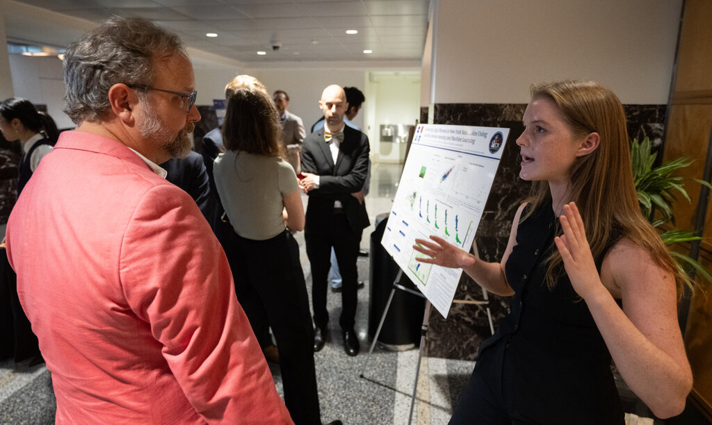
The goal isn't to show every single detail. Instead, a poster offers a high-level overview. It highlights the most important parts of the research: the question you asked, the methods you used, your key findings, and what it all means. It's a way to share your work quickly and effectively with a wide audience who might be walking by in a busy hall.
A great poster makes someone stop, look, and want to learn more.
The Anatomy of a Poster
While formats can vary by field, most academic posters follow a logical structure that mirrors a research paper. The layout guides the reader's eye from the big picture down to the important details.
| Component | Purpose |
|---|---|
| Title & Authors | Clearly states the project's topic and who conducted the research. Should be large and easy to read from a distance. |
| Introduction | Briefly provides context. Why is this research important? What question are you trying to answer? |
| Methods | Explains how you conducted the research. This section should be concise, focusing on the overall approach. |
| Results | Presents your key findings. This is often the most visual part of the poster, relying on graphs and charts. |
| Conclusion | Summarizes the main takeaways. What do your results mean? What are the implications or next steps? |
| References & Acknowledgments | Cites key sources and thanks individuals or institutions that supported the work. This is usually in a smaller font. |
This structure creates a clear narrative, guiding viewers through your research journey from start to finish.
A well-designed poster should be able to stand alone, conveying the key points of your research even when you're not present to explain it.
Clarity and Conciseness are Key
The most common mistake is treating a poster like a miniature version of a research paper, packed with dense text. A poster is a visual medium. Viewers should be able to grasp your main points in just a few minutes.
Use bullet points, short sentences, and clear headings. Avoid jargon whenever possible. Every word and image should serve a purpose. If something doesn't contribute to the main story of your research, leave it out.
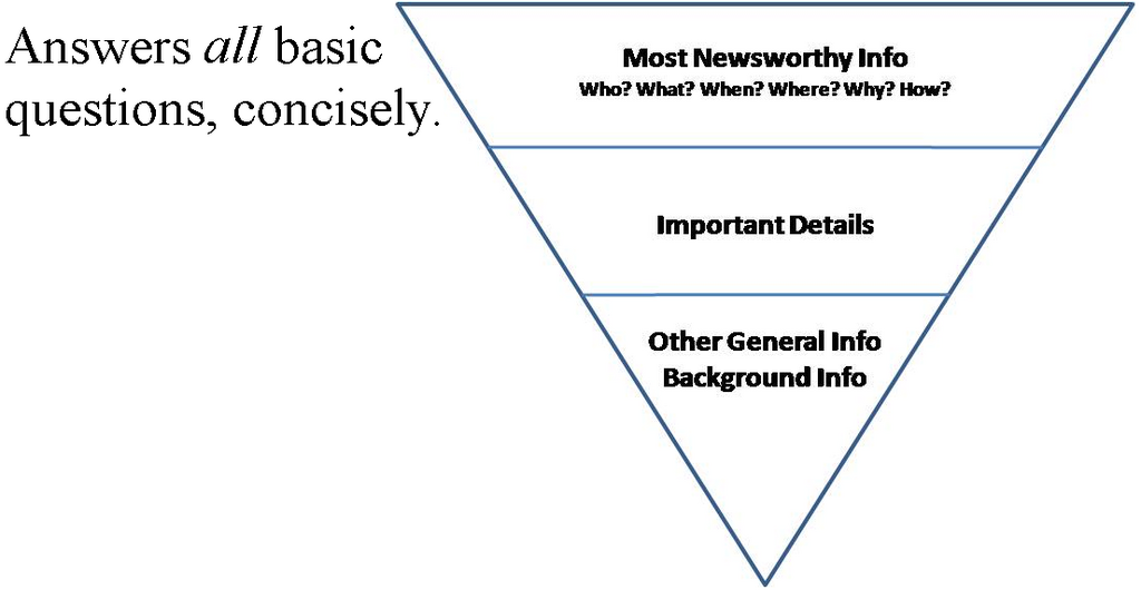
Think of the text as support for your visuals, not the other way around. Your poster should have plenty of white space to avoid looking cluttered. This makes it easier to read and more inviting to the eye.
The Role of Visuals
Visual elements are the heart of a good poster. They do the heavy lifting, communicating complex information much faster than text can. High-quality graphs, charts, diagrams, and images should be central to your design.
Use high-quality images, charts, and graphs to help illustrate your research and make it more engaging.
Each visual should be simple, clean, and easy to understand on its own. Make sure axes are labeled, captions are clear, and colors are used strategically to highlight important data points. A confusing graph is worse than no graph at all. The goal is to make your results pop off the page and tell a compelling story at a glance.
Ready to check your understanding? Let's review the key ideas.
What is the primary purpose of an academic poster?
True or False: The most effective academic posters are designed like miniature research papers, packed with dense paragraphs of text.