Professional Web Design and User Interface Systems
Visual Hierarchy Fundamentals
Guiding the Eye
Every well-designed interface acts as a silent guide. It doesn't just present information; it tells you where to look first, what's most important, and what's related. This intentional direction is the core of visual hierarchy. It’s the art of arranging elements to control a user's attention with purpose.
Your goal isn't just to make a page look good. It's to make it understandable at a glance.
This is achieved by assigning different visual weights to elements. A large, bright red button has more weight than a small, grey link. Our eyes are naturally drawn to heavier elements. By manipulating size, color, and contrast, you can create directional cues that lead the user through a series of actions or pieces of information, just like a roadmap.
Structuring with Space and Shape
How users scan a page isn't random. In text-heavy layouts, like blogs or search results, they often follow an F-Pattern, scanning horizontally across the top, then down the left edge, with shorter horizontal scans on the way. For simpler, more visual pages, a Z-Pattern is common, where the eye moves from top-left to top-right, down and across to the bottom-left, and finally to the bottom-right. Understanding these patterns allows you to place critical elements, like calls-to-action, directly in the user’s natural path.
But you can also create your own patterns using whitespace and grouping. The empty space on a page is just as important as the content. Strategic use of whitespace, or negative space, reduces cognitive load and creates relationships between elements. This is where Gestalt principles come into play.
These psychological shortcuts help users make sense of layouts instantly. Items close together (Proximity) are perceived as a group. Items that share visual characteristics like color or shape (Similarity) are seen as related. Elements placed within a shared boundary (Common Region) feel connected. You don't need to explain these relationships; the user's brain does the work for you.
Building with Type and Color
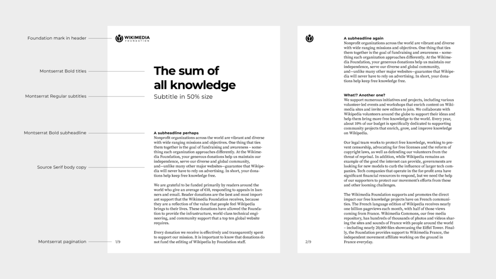
Typography is one of the most powerful tools for establishing hierarchy. A well-defined creates a clear order of importance, guiding the user from headlines to body text. This isn't about picking random font sizes; it's about creating a system. A common practice is to use a modular scale, where each text size is derived by multiplying the previous one by a set ratio (e.g., 1.25, 1.414, or the golden ratio of 1.618). This creates a harmonious and predictable rhythm.
This connects to vertical rhythm, the idea of maintaining a consistent baseline grid for all text elements. If your base font size is 16px with a line height of 24px, then all vertical spacing (margins, padding) should be in multiples of 24px. This creates a subtle but powerful sense of order and makes long-form text much easier to read.
| Element | Font Size | Line Height | Margin-Top |
|---|---|---|---|
<h1> | 48px | 56px | 56px |
<h2> | 32px | 40px | 56px |
<p> | 16px | 24px | 24px |
<caption> | 12px | 16px | 24px |
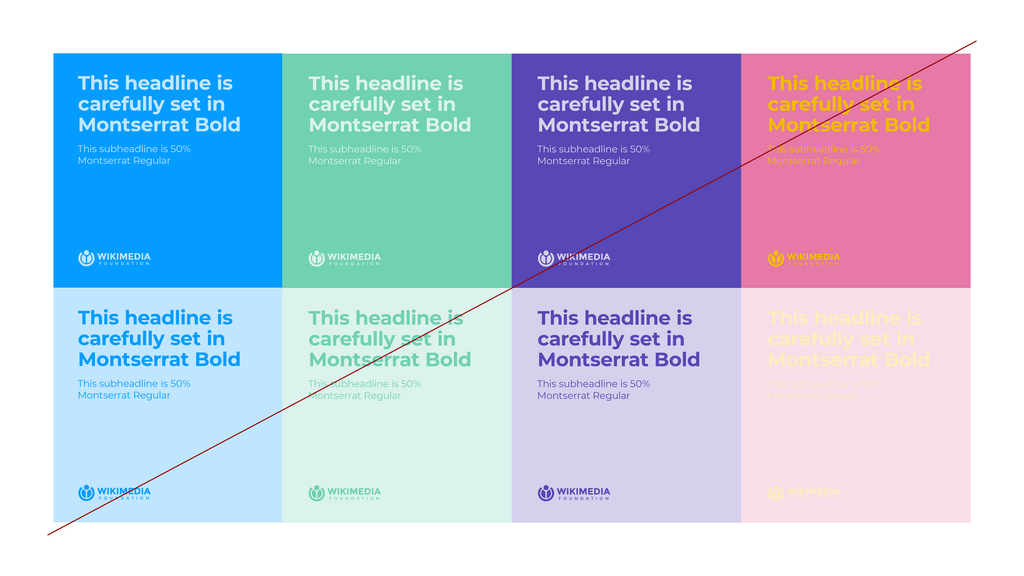
Color works in a similar way. Instead of just being decorative, color in UI is functional. It's used to draw attention, signify status, and create associations. A functional color palette might define specific colors for primary actions (bright blue), destructive actions (red), and success states (green). are critical here. It doesn't matter how beautiful your color scheme is if users can't read the text. High contrast between text and its background is non-negotiable for accessibility and usability.
By mastering these principles of space, typography, and color, you move from simply placing elements on a page to designing a clear, intuitive experience that respects the user's attention and guides them to their goal.
What is the primary purpose of visual hierarchy in user interface design?
You are designing a blog page with long articles and a sidebar. Which scanning pattern are users most likely to follow, and where should you place the most critical information?