Modern App Development
HTML and CSS
Structuring the Web with HTML
Every website you visit is built on a foundation of HTML, which stands for HyperText Markup Language. Think of it as the skeleton of a webpage. It provides the basic structure and organizes the content, telling the browser what's a heading, what's a paragraph, and where to put images.
HTML uses 'elements' to define different parts of the content. Most elements are written with a starting tag and an ending tag, with the content sitting in between. For example, to create a paragraph, you wrap your text in <p> and </p> tags.
<!DOCTYPE html>
<html>
<head>
    <title>My First Page</title>
</head>
<body>
    <h1>This is a Main Heading</h1>
    <p>This is a paragraph of text.</p>
</body>
</html>
This basic structure is the starting point for any webpage. The <h1> element creates a top-level heading, and the <p> element creates a standard paragraph. When a browser reads this file, it knows exactly how to display the content.

Elements can also have 'attributes', which provide extra information. Attributes are always included in the starting tag and usually come in name/value pairs like name="value". A common example is the anchor tag <a>, which creates a link. Its href attribute specifies the URL the link should go to.
<a href="https://www.wikipedia.org">Go to Wikipedia</a>
Giving It Style with CSS
While HTML provides the structure, Cascading Style Sheets (CSS) brings the style. If HTML is the skeleton, CSS is the clothing, paint, and furniture. It controls colors, fonts, spacing, and the overall layout of the page. This separation is powerful: you can completely change a site's look and feel just by changing the CSS, without ever touching the HTML.
HTML creates the structure of the blog website, and CSS adds styles to make the UI better.
A CSS rule has two main parts: a selector and a declaration block. The selector points to the HTML element you want to style. The declaration block contains one or more property and value pairs, which define the styles to apply.
/* This CSS rule targets all paragraph elements */
p {
  color: navy;
  font-size: 16px;
}
In this example, p is the selector. It targets every <p> element on the page. The properties are color and font-size, and their values are navy and 16px, respectively. To get more specific, you can use class or ID selectors. An ID is unique to one element, while a class can be used on many.
| Selector Type | Example | Description |
|---|---|---|
| Element | h1 { ... } | Selects all <h1> elements. |
| Class | .highlight { ... } | Selects any element with class="highlight". |
| ID | #main-header { ... } | Selects the one element with id="main-header". |
Building Smarter and Better
Using the right HTML element for the job is called 'semantic HTML'. Instead of using generic <div> elements for everything, you can use more descriptive tags like <header>, <footer>, <nav>, and <article>. This doesn't change how the page looks by default, but it gives the content more meaning. This is crucial for search engines trying to understand your page and for accessibility tools like screen readers that help visually impaired users navigate the content.
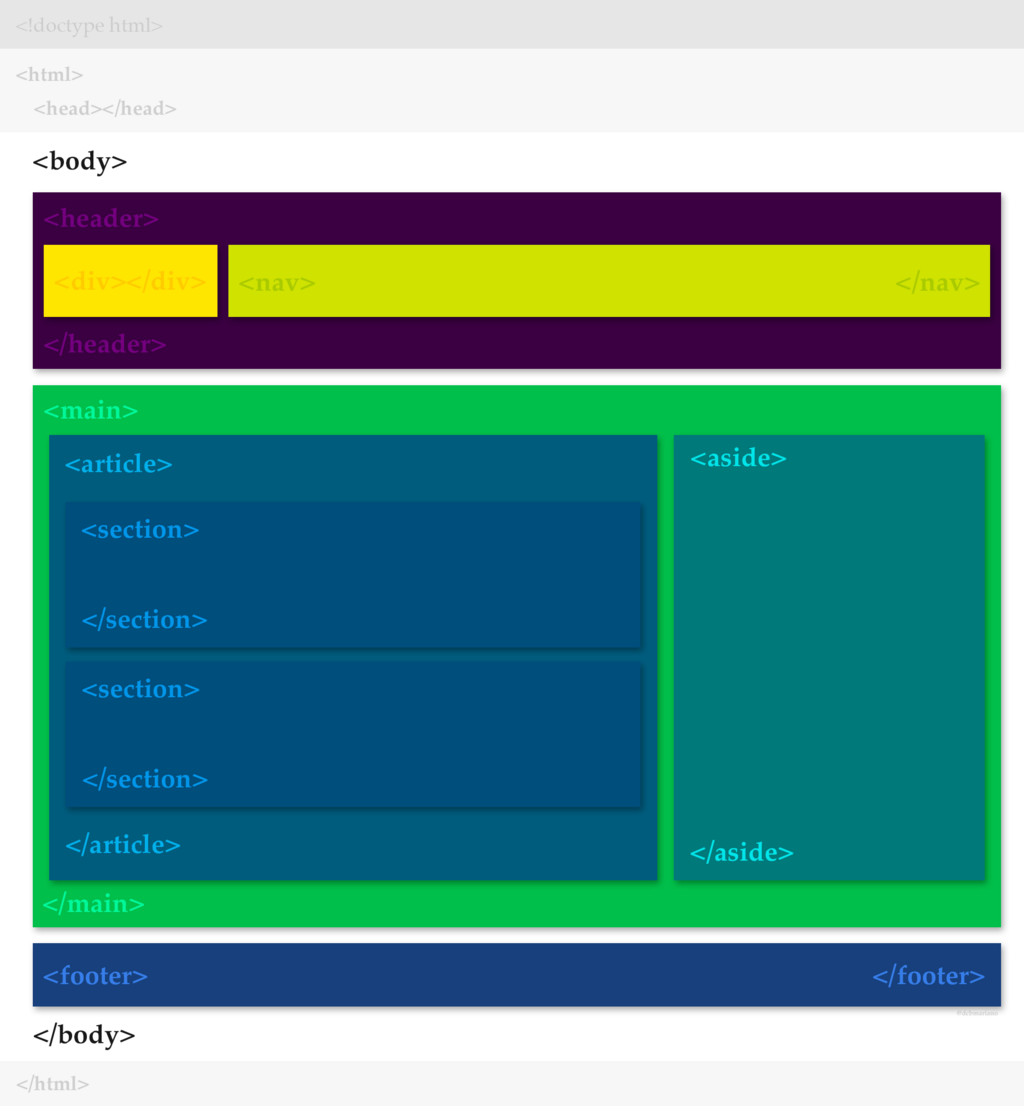
Today, people browse the web on phones, tablets, and giant monitors. 'Responsive design' is the practice of making your website look great on all of them. It’s not about creating separate sites for each device. Instead, you build one flexible site that adapts its layout to the screen size.
CSS is the key to responsive design. Techniques like flexible grids and 'media queries' allow you to apply different styles based on the device's characteristics, like its width. For instance, a multi-column layout on a desktop might stack into a single column on a mobile phone for easier reading.
The core idea of responsive design is that content should flow and reflow to fit the available space, ensuring a good user experience everywhere.
Ready to check your understanding of these core concepts?
What is the primary function of HTML?
In the CSS rule h1 { color: navy; }, what is color called?
Mastering HTML for structure and CSS for style are the first, most important steps in web development. They are the fundamental building blocks for everything you see on the web.