Mastering Power BI for Business Insights
Introduction to Power BI
What Is Power BI?
Power BI is a tool from Microsoft that helps people make sense of data. Think of it as a bridge between raw, messy numbers and clear, insightful stories. Instead of staring at massive spreadsheets, you can use Power BI to create interactive charts, graphs, and maps that reveal patterns and trends.
Power BI is a data visualization and business intelligence tool that allows users to connect to various data sources, clean and transform data, and build visual dashboards that tell compelling data stories.
The main goal is to turn data into actionable information. Businesses use it to track sales, analyze marketing campaigns, or manage inventory. By visualizing data, they can spot what's working and what isn't, helping them make smarter decisions. It connects to hundreds of data sources, from simple Excel files to complex cloud databases.
The Power BI Ecosystem
Power BI isn't just a single application. It's a collection of services that work together. Understanding these components is key to understanding the workflow.
Power BI is far more than just a data visualization tool; it represents a powerful ecosystem that includes Power BI Desktop, Power BI Service, and Power BI Mobile.
The three main parts are:
-
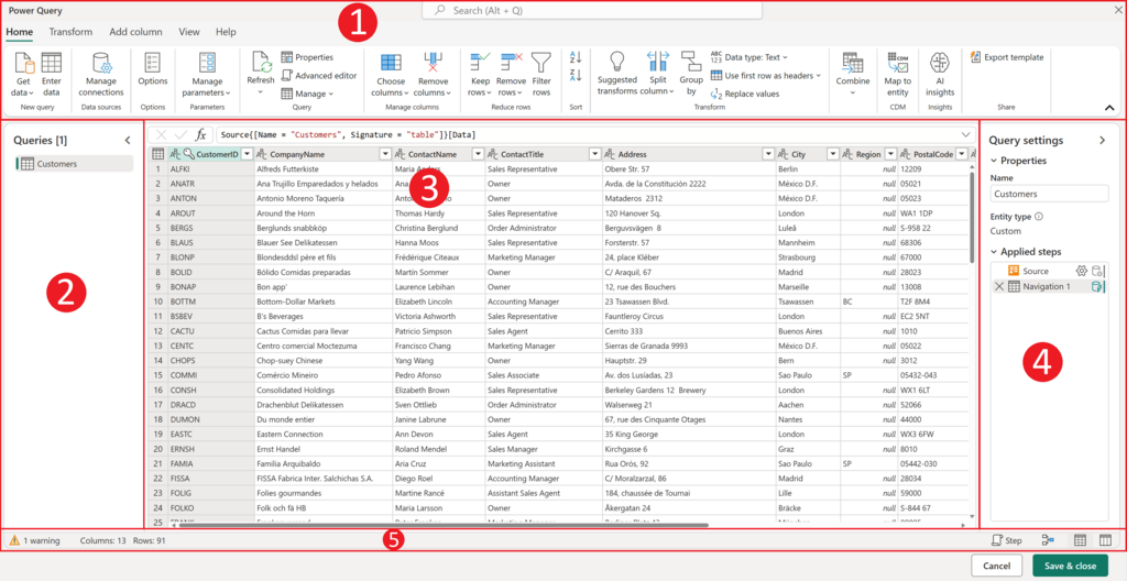
Power BI Desktop: This is the free application you install on your computer. It’s the workshop where you do the heavy lifting. You connect to your data sources, clean up the data (a process called transformation), and design your reports and visuals.
-
Power BI Service: This is the cloud-based platform (app.powerbi.com). Once you've built a report in Desktop, you publish it to the Service. Here, you can share your reports with colleagues, assemble them into dashboards, and set up automatic data refreshes.
-
Power BI Mobile: These are apps for phones and tablets. They let you view and interact with your published reports and dashboards from anywhere.
A Quick Tour of the Interface
When you first open Power BI Desktop, you'll see a central canvas and several key panes. Let's focus on the main building blocks you'll use to create a report.
The interface is designed to be intuitive. On the right, you have two important panes:
- Visualizations pane: This is your toolbox for charts. You can choose from bar charts, line graphs, pie charts, maps, and more. This is also where you format them, changing colors, labels, and titles.
- Fields pane: Once you load data, all your tables and columns appear here. To build a visual, you simply drag a field (like 'Sales' or 'Date') from this pane onto your report canvas or into the Visualizations pane.
The large central area is the Report canvas. This is your workspace where you arrange and resize your visuals to build a report page. Think of it as a blank sheet of paper waiting for your data story.
The basic workflow is: Connect to data, drag fields onto the canvas, and choose a visualization to display it.
This foundation allows you to start exploring your data visually. Instead of just seeing rows of numbers, you begin to see the relationships and insights hidden within them. This process of visual exploration is the core of data analysis in Power BI.
What is the primary purpose of Power BI?
Which component of the Power BI ecosystem is the cloud-based platform used for sharing reports and creating dashboards?
With these basics in mind, you're ready to start connecting to data and building your first visuals.