Graphic Design and Animation for Storytelling
Visual Storytelling Principles
Framing the Narrative
You already know how to make a design look good. Now, let's make it speak. Composition in storytelling is about arranging elements not just for aesthetic balance, but to direct the viewer's attention and control the narrative's flow. It's the art of turning a picture into a purposeful statement.
Think of techniques like the rule of thirds. Placing key elements off-center, where the lines of a 3x3 grid intersect, creates more tension and interest than a perfectly centered subject. It feels more dynamic, more natural. Similarly, leading lines—like roads, fences, or the gaze of a character—act as visual pathways, pulling the viewer's eye through the scene and toward a focal point. These aren't just rules; they are tools for guiding your audience through the story you want to tell.
The feeling of a scene can also be shaped by balance. A symmetrically balanced composition often feels calm, stable, or even rigid. In contrast, an asymmetrical layout can create a sense of unease, movement, or energy. By intentionally choosing how to arrange and balance the subjects in your frame, you're setting the emotional stage for the story.
Painting with Emotion
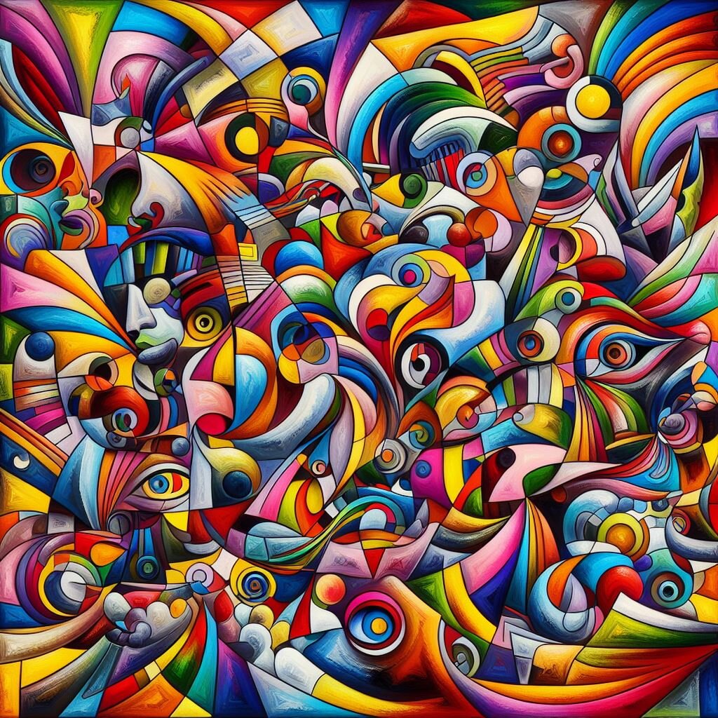
Color does more than fill in the lines; it sets the mood. It's a universal language for emotion. A shift in the color palette can signal a change in time, a character's emotional state, or the tone of the story itself. For example, a scene drenched in warm, golden light feels nostalgic and safe, while the same scene cast in cold, blue tones might feel lonely or ominous.
A monochromatic palette, using variations of a single color, can create a powerful sense of unity and mood. An analogous scheme, with colors that sit next to each other on the color wheel, feels harmonious. A complementary palette, using opposite colors, creates high contrast and visual tension.
Consider the saturation and brightness of your colors as well. Highly saturated, bright colors can convey energy, joy, or even mania. Desaturated, muted colors can suggest solemnity, memories, or a dystopian world where life has been drained away. By consciously crafting a color script for your narrative, you can guide your audience's feelings without a single word of dialogue.
Guiding the Eye
Visual hierarchy is the order in which a viewer processes the information in a design. In storytelling, you use it to reveal the narrative piece by piece. What do you want your audience to see first? What's the second most important detail? The third?
You create this order using contrast, scale, and placement. Our eyes are naturally drawn to what stands out:
- Size: Larger elements feel more important than smaller ones.
- Color: A splash of bright color in a muted scene will grab attention immediately.
- Contrast: High contrast between an element and its background makes it a focal point.
- Placement: Elements in the foreground or center are often perceived as more significant.
The key is to focus on strong storytelling and appealing visuals.
By mastering visual hierarchy, you become the story's tour guide. You can build suspense by hiding a key detail in the background, create a clear protagonist by making them the largest and most contrasted element, or show a character's journey by leading the eye from one point of interest to the next in a deliberate sequence.
Images That Mean More
The most powerful visual stories operate on multiple levels. On the surface, you see a character and a setting. But underneath, symbolism and metaphor can add layers of meaning, transforming a simple scene into a profound statement.
Symbolism
noun
The use of objects, people, or colors to represent abstract ideas or concepts.
A wilting flower on a windowsill might symbolize dying hope. A recurring image of a bird could represent a character's desire for freedom. These symbols enrich the narrative, allowing you to communicate complex ideas efficiently and poetically. They invite the audience to look deeper and engage with the story on a more intellectual and emotional level.
A visual metaphor goes a step further, comparing two unlike things to suggest a deeper similarity. An image of a character trapped in a maze of city streets could be a metaphor for their mental confusion. A shot of a skyscraper casting a long shadow over a small house could metaphorically represent the power of a corporation over an individual.
By weaving these elements into your visuals, your stories gain depth and resonance. They become more than just a sequence of events; they become a meaningful exploration of ideas.
According to the rule of thirds, where should key elements be placed to create a more dynamic and interesting composition?
A filmmaker wants to create a scene that feels somber and nostalgic. Which color palette would best achieve this mood?
These principles—composition, color, hierarchy, and symbolism—are the building blocks of effective visual narrative. Mastering them allows you to move beyond simply decorating a screen and start telling stories that captivate, persuade, and endure.