Full Stack Web Development Essentials
Introduction to Web Development
The Blueprint of the Web
Every website you visit is built on a foundation of HTML, which stands for HyperText Markup Language. Think of it as the skeleton or the blueprint of a webpage. It doesn't handle colors, fonts, or animations, but it gives the page its fundamental structure.
HTML uses 'tags' to define different types of content. A tag is usually a keyword wrapped in angle brackets, like <h1>. Most tags come in pairs: an opening tag and a closing tag. The closing tag has a forward slash before the keyword, like </h1>. Whatever content you put between the opening and closing tags gets structured accordingly.
For example,
<h1>creates a top-level heading,<p>creates a paragraph, and<a>creates a clickable link.
A basic HTML document has a standard structure that tells the browser how to interpret the file. It includes a <!DOCTYPE html> declaration, followed by <html>, <head>, and <body> tags. The <head> contains meta-information, like the page title, while the <body> holds all the visible content.
<!DOCTYPE html>
<html>
<head>
    <title>My First Web Page</title>
</head>
<body>

    <h1>Welcome to My Site</h1>
    <p>This is my first paragraph.</p>

</body>
</html>
Adding Style with CSS
While HTML provides the structure, Cascading Style Sheets (CSS) brings the design. If HTML is the blueprint of a house, CSS is the paint, furniture, and decorations. It controls colors, fonts, spacing, and the overall layout of the content.
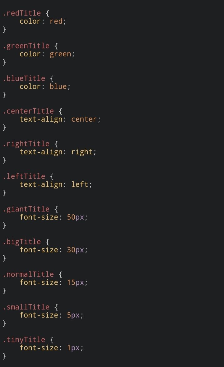
CSS works by selecting HTML elements and applying style rules to them. A rule consists of a selector (which element to target) and a declaration block (what styles to apply). For instance, you could select all <p> tags and make their text blue.
/* This is a CSS comment */

/* Selects all paragraph elements */
p {
    color: blue;
    font-size: 16px;
}

/* Selects all h1 elements */
h1 {
    color: darkslategrey;
    text-align: center;
}
You can link a CSS file to your HTML document. This separation of concerns is a core principle in web development. It keeps your structure (HTML) clean and your styling (CSS) manageable and reusable.
Making it Look Good Everywhere
Today, people browse the web on everything from tiny phones to massive desktop monitors. A website that looks great on a laptop might be unusable on a phone if the text is too small or elements are off-screen. This is where responsive design comes in.
Responsive design is the practice of making your web pages look good on all devices. The layout automatically adapts to the user's screen size. This isn't just a nice feature; it's essential for a good user experience.
The main tool for responsive design in CSS is the media query. A media query allows you to apply specific styles only when certain conditions are met, like when the screen is narrower than a certain width. This lets you rearrange elements, change font sizes, or even hide content to create the best possible layout for the device.
/* Base styles for the sidebar */
.sidebar {
  width: 30%;
  float: right;
}

/* Media query for screens 600px or less */
@media screen and (max-width: 600px) {
  .sidebar {
    width: 100%; /* Take up full width */
    float: none;   /* Stop floating */
  }
}
With HTML for structure and CSS for styling and layout, you can create a static web page. A static page is one that is delivered to the user exactly as it's stored. The content doesn't change based on user interaction or other factors. It’s the perfect starting point for learning web development, allowing you to build portfolios, informational sites, and blogs.
Now, let's test what you've learned about the foundations of the web.
What is the primary role of HTML in web development?
Which of the following contains the visible content of an HTML document, such as text, images, and links?
Understanding HTML and CSS is the first major step in becoming a web developer. These two languages are the bedrock of everything you see online.