Full Stack Python Job Roadmap
Web Foundations
The Structure of a Web Page
Every website you visit is just a collection of documents. Your web browser, like Chrome or Firefox, reads these documents and displays them as the interactive pages you know. The most fundamental of these documents is written in a language called (HTML).
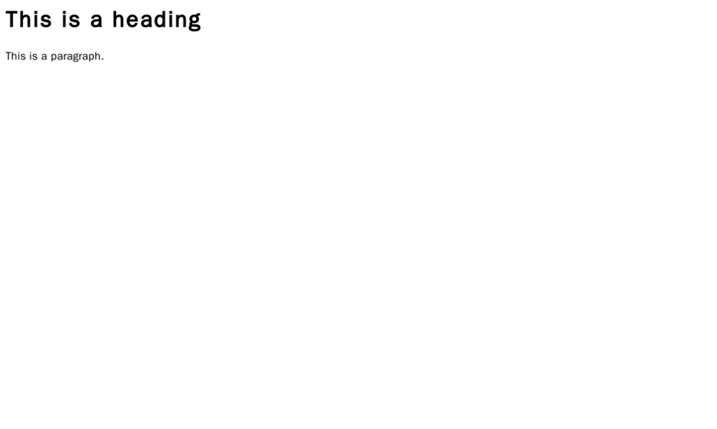
Think of HTML as the skeleton of a webpage. It provides the basic structure and content. It doesn't handle colors, fonts, or layout; it just defines what the content is. For example, HTML tells the browser, "This is a heading," "This is a paragraph," or "This is a list."
We do this using 'tags,' which are keywords wrapped in angle brackets. Most tags come in pairs: an opening tag like <h1> and a closing tag like </h1>. Everything between them is the content of that element.
<h1>This is a main heading</h1>
<p>This is a paragraph of text.</p>
Years ago, developers used generic <div> tags for everything, which was like building a skeleton with only one type of bone. It worked, but it was confusing. Modern HTML5 introduced semantic tags, which describe the meaning of the content within them. This makes your code easier to read and is crucial for search engines and accessibility tools.
Using semantic tags like
<header>,<main>, and<footer>gives your webpage a meaningful structure, just like using a spine, ribs, and skull gives a skeleton its shape.
Adding Style with CSS
A skeleton isn't very appealing on its own. To bring our webpage to life, we use (CSS). CSS is the language we use to style our HTML document. It controls the colors, fonts, spacing, and layout. If HTML is the skeleton, CSS is the skin, hair, and clothing.
CSS works by selecting an HTML element and then applying a set of style rules to it. The basic syntax looks like this:
selector {
  property: value;
}
For example, to make all <h1> elements red with a specific font, we would write:
h1 {
  color: red;
  font-family: Arial, sans-serif;
}
Every element on a webpage can be thought of as a rectangular box. The CSS Box Model is the set of rules that defines how this box is sized and spaced. Understanding it is fundamental to controlling layout.
| Part | Description |
|---|---|
| Content | The actual text, image, or other media in the element. |
| Padding | The transparent space between the content and the border. |
| Border | A line that goes around the padding and content. |
| Margin | The transparent space outside the border, separating it from other elements. |
Arranging Your Content
Once you understand that everything is a box, the next step is arranging those boxes. For years, this was surprisingly difficult, but modern CSS has given us two powerful tools for creating layouts: Flexbox and Grid.
Flexbox is perfect for arranging items in a single dimension, either as a row or a column. Think of it for navigation bars or aligning items within a component.
Grid is designed for two-dimensional layouts, managing both rows and columns at the same time. It's ideal for overall page layouts.
Another crucial concept is Responsive Design. Today, people browse the web on phones, tablets, laptops, and giant monitors. A website that looks great on a desktop might be unusable on a phone. Responsive design uses techniques like to apply different CSS rules based on the screen size, ensuring a good experience for everyone.
/* This CSS will only apply on screens smaller than 600px */
@media (max-width: 600px) {
  .container {
    flex-direction: column; /* Stack items vertically on small screens */
  }
}
Your First Project
Now it's time to put it all together. For your first project, you will build a static 'About Me' page. This will serve as the foundation for your professional portfolio throughout this course.
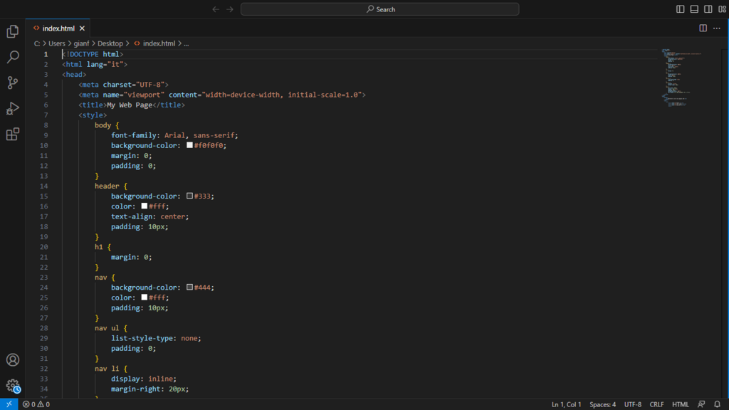
You'll use semantic HTML5 tags to structure your content: a header with your name, a main section with a short bio and your skills, and a footer with contact links.
Then, you'll use CSS to style it. You'll apply the box model to manage spacing, use Flexbox or Grid to create a clean layout, and add some basic media queries to make sure it looks good on a phone.
Finally, a quick word on accessibility (often abbreviated as a11y). This means designing your site so that people with disabilities can use it. Using semantic HTML is a huge first step. Simple things, like adding descriptive text for images, ensure that users with screen readers can understand your content. We'll touch on this more as we go.
Let's check your understanding of these core concepts.
What is the primary role of HTML (HyperText Markup Language) on a webpage?
If HTML is the 'skeleton' of a webpage, what is the best analogy for CSS (Cascading Style Sheets)?
By mastering HTML for structure and CSS for presentation, you've taken your first major step into web development. You now have the foundational skills to build any static website.