DaVinci Resolve Color Grading Mastery
Color Theory Basics
The Color Wheel
Think of the color wheel as a map for colors. It organizes them in a logical way, showing how they relate to one another. Understanding this map is the first step to using color effectively, whether you're painting a room or grading a film.
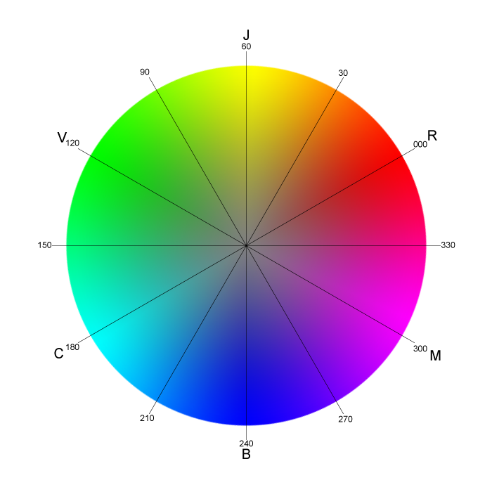
This simple circle is the foundation of color harmony, contrast, and style. At its heart are three colors that can't be created by mixing others. They are the source of every other color on the wheel.
Building Blocks of Color
All colors begin with a small, exclusive group known as the primary colors. In the traditional color model used by artists for centuries, these are red, yellow, and blue. You can't mix other colors to get red, yellow, or blue; they are the originals.
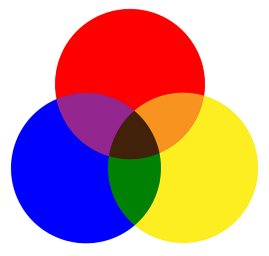
When you mix two primary colors, you get a secondary color:
- Red + Yellow = Orange
- Yellow + Blue = Green
- Blue + Red = Purple
Take it one step further by mixing a primary color with a neighboring secondary color, and you get a tertiary color. These have two-part names like red-orange, yellow-green, or blue-violet. They are the shades that bridge the primary and secondary colors, filling out the color wheel with a full spectrum of hues.
Making Colors Work Together
Color harmony is the art of choosing colors that create a pleasing effect. There are many ways to do this, but one of the most powerful and widely used principles is based on complementary colors.
Complementary colors are pairs of colors that sit directly opposite each other on the color wheel.
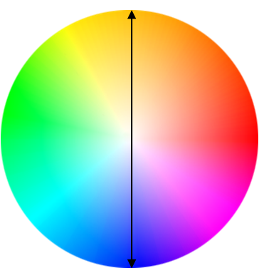
Examples include red and green, orange and blue, and yellow and purple. When placed next to each other, these pairs create the strongest possible contrast. This makes both colors appear brighter and more vibrant. In film, this is often used to draw the viewer's eye to a specific part of the screen or to create a sense of tension and energy.
Color and Emotion
Colors don't just look a certain way; they feel a certain way. We have deep-seated associations with different colors that can instantly set a mood. While these can vary across cultures, some general patterns hold true in visual storytelling.
| Color | Common Associations |
|---|---|
| Red | Passion, anger, love, danger |
| Blue | Calm, sadness, trust, stability |
| Yellow | Happiness, energy, warmth |
| Green | Nature, jealousy, health, envy |
A filmmaker might use a blue tint to convey a somber mood, or a golden-yellow glow to evoke a happy memory. This psychological aspect of color is a subtle but powerful tool for telling a story without words. Understanding these basics allows you to make deliberate choices that support the narrative and guide the audience's emotional journey.